Gaia's Garden | 2024
ux design • brand identity
Collaborators
Sarika Bhageratty
Rosa Moriya
Tools
Figma
Adobe Illustrator
Adobe After Effetcs
Duration
7 weeks
PROBLEM
The rise of delivery meal/ingredient apps
We've seen the rise of delivery meals and ingredient products like Hello Fresh, Uber eats, or Instacart. This offers a variety of options for people who want to save time and have a more balanced diet.
An investigation from CBC found that these companies are not that transparent. Many of them have hidden markups, and are not as green as some of them promised (2022).
Read about CBC's investigationOpportunity for local, transparent and sustainable products
Nowadays, we're observing a shift towards alternatives like Fresh City Farms, Mama Earth, Mabel's, and the Healthy Butcher.
These companies have partnered with local farms, helping them deliver their products to more environmentally-conscious and healthy consumers. However, most of these products don't have an app that is easy for consumers to use.
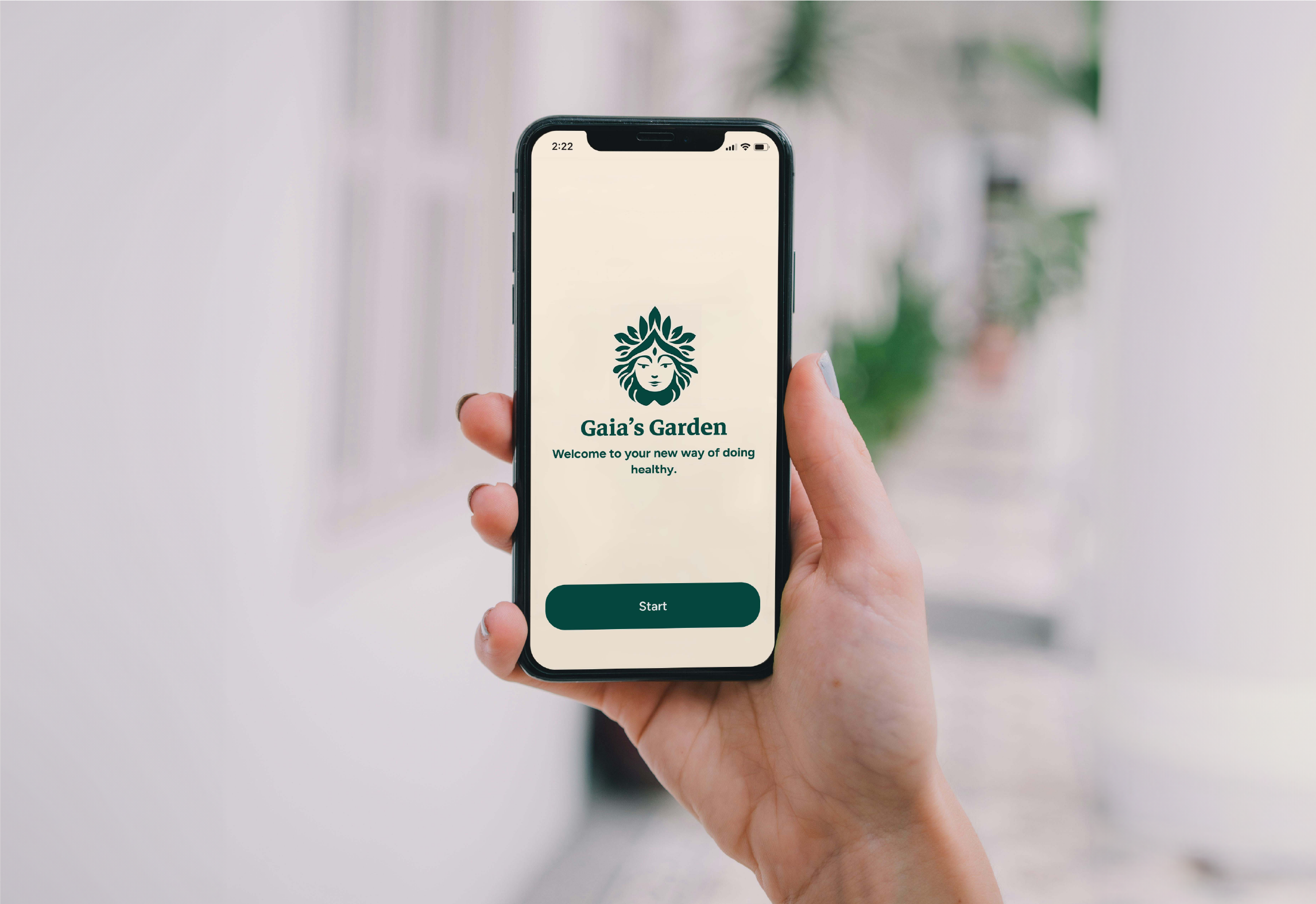
Our solution?
Gaia's Garden, a native app that offers a
quick,
convenient and
transparent way to purchase
and get delivered organic produce and meal boxes outsourced
directly from local farmers.
USER
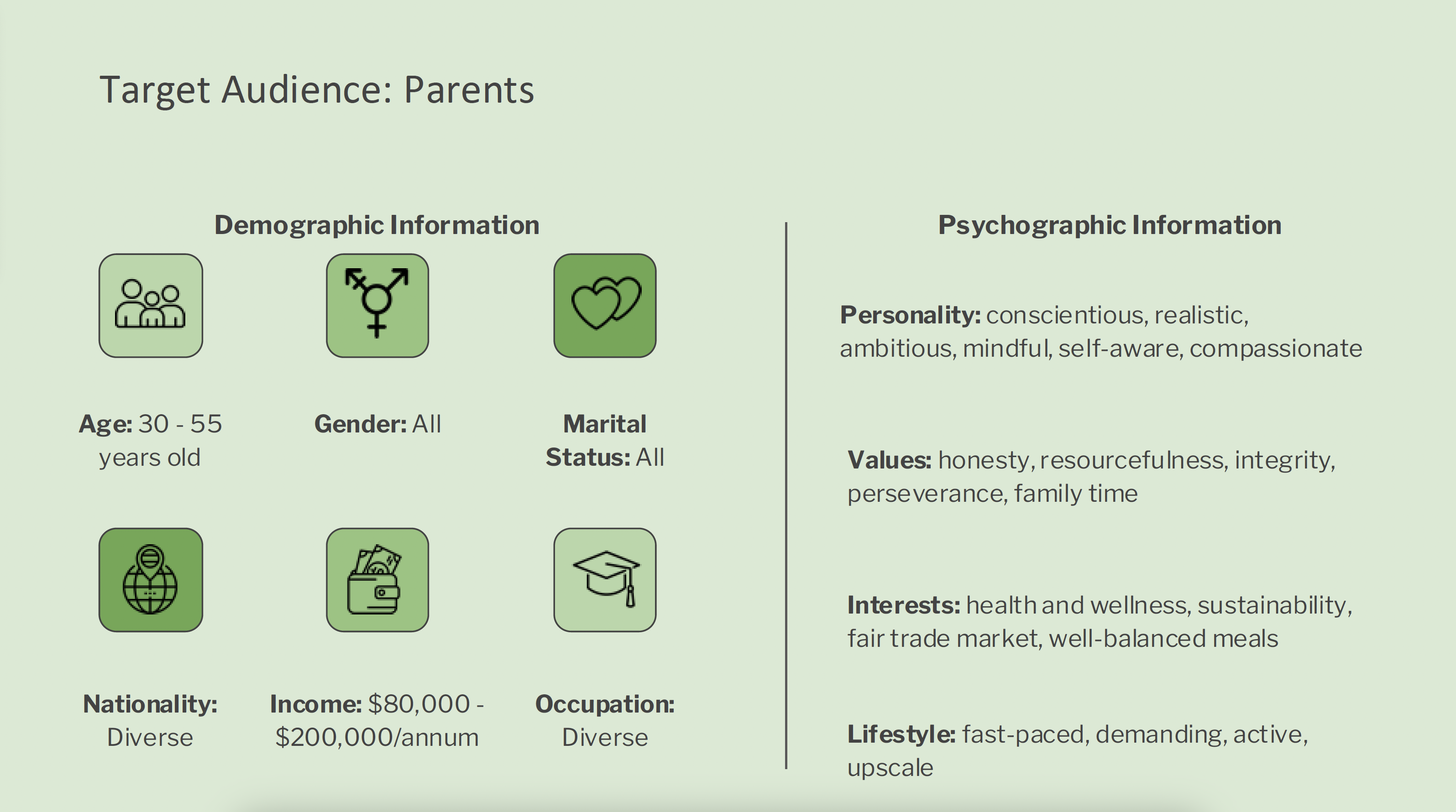
Figure 1: Target Audience
We developed two distinct user personas to represent the primary users of the platform: working parents (Figure 2), and stay-at-home parents (Figure 3), to better understand their unique needs and preferences.
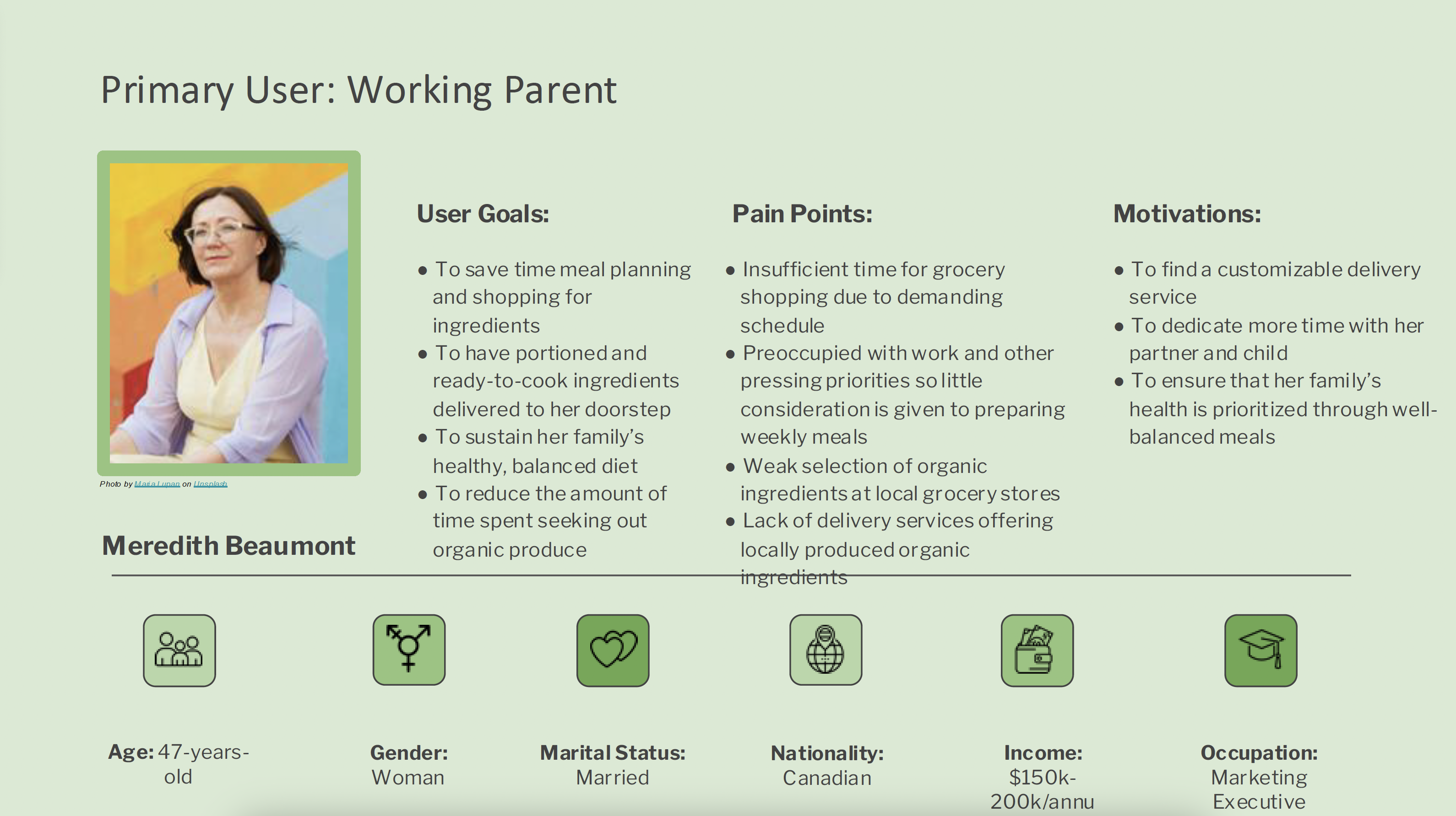
Figure 2: User Persona 1
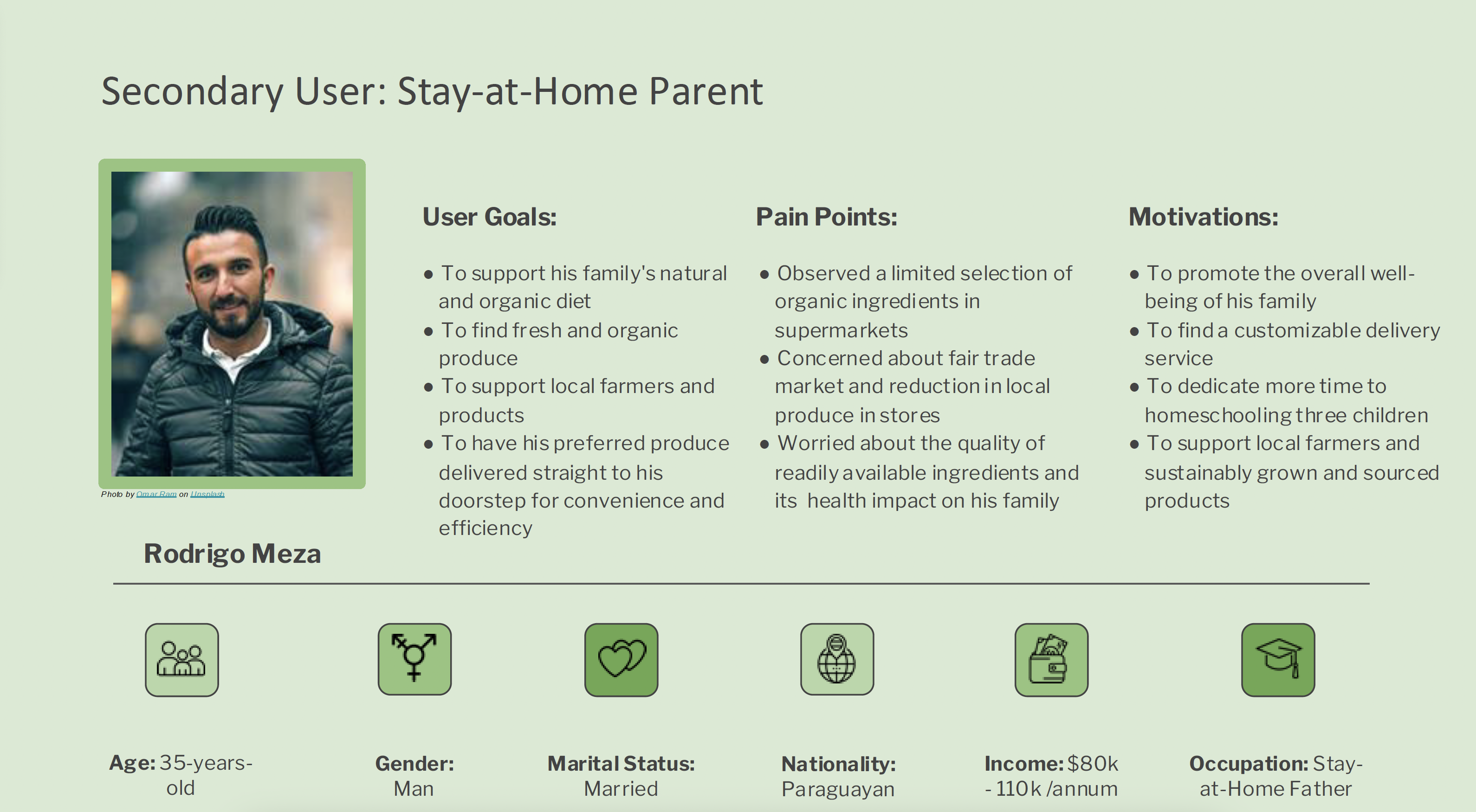
Figure 3: User Persona 2
Journey Mapping
To ensure Gaia's Garden provides a seamless and intuitive experience, we developed user journey maps based on our primary personas. This process allowed us to visualize their interactions with the app - from identifying pain points and researching alternatives to discovering the service, placing an order, and receiving their meal boxes (Figure 4) or organic produce (Figure 5).
By mapping out their journeys, we identified key touchpoints, potential pain points, and opportunities to enhance the overall user experience, ensuring a more efficient and satisfying process tailored to their needs.
 Figure 4: View our full Journey Map #1
 Figure 5: View our full Journey Map #2
RESEARCH
SWOT Analysis
To better position Gaia's Garden in the market, we conducted a SWOT analysis of key competitors in the organic produce and meal delivery sector (Figure 6). This analysis helped us identify their strengths, weaknesses, opportunities, and threats, allowing us to uncover gaps in their services and areas where Gaia's Garden could stand out. By understanding the competitive landscape, we aimed to refine our value proposition and enhance the overall user experience.
Figure 6: SWOT Analysis
Breaking down different design patterns
By breaking down different design patterns used by competitor platforms, we analyzed their key features, navigation, and overall usability (Figure 7). This research provided valuable insights to inform the design of Gaia's Garden and create a smooth, intuitive experience for our users.

Figure 7: Breaking down different design patterns
BRAND IDENTITY
Gaia's Garden

Gaia is the personification of Earth
We wanted to create a garden where Canadians can feel proud and connected to their local products and farmers. We wanted to start by creating a mobile app that is easy and fun for consumers to use.
Users would be able to choose ingredients, meals, packs, share their recipes with others, and more features that will add value to our users' lives and support our farmers.
Style Tile
Gaia's Garden's brand identity is built around its core values of sustainability, friendliness, transparency, and warmth.
To bring these attributes to life, we created a style tile that defines the color palette, typography and iconography (Figure 8). This cohesive visual language ensures a consistent and engaging experience, reflecting the brand's mission while promoting a welcoming and user-friendly atmosphere.
 Figure 8: View our style exploration
Logo Animation
To add more personality to Gaia's Garden, I created a playful logo animation featuring Gaia winking.
This animation reinforces the brand's friendly and playful tone while adding a touch of sass. The wink serves as Gaia's stamp of approval, assuring users that they are making a positive impact on their health, the environment, and the community. It's a fun and engaging way to connect with users while also reinforcing the brand's values.

USABILITY
User Flows
To create a seamless experience for Gaia's Garden, we developed two user flows based on our two primary personas.
These flows map out the key steps each user takes to interact with the app, from opening the app to completing an order.
1. Subscribing to a meal kit (Figure 9) : This flow focuses on users susbscribing to a weekly meal kit.
Figure 9: User Flow #1 - Subscribing to a meal kit
2. Subscribing to a produce box (Figure 10) : This flow focuses users subscribing to a produce box
Figure 10: User Flow #2 - Subscribing to a produce box
Low-Fidelity Wireframes
As a group of three, we decided to collaborate closely rather than dividing tasks individually. Each of us designed a low-fidelity wireframe for the homepage, and then we came together to consolidate our ideas (Figure 11). We analyzed each design and selected the elements that best aligned with the project's goals and the brand's vision and core values. This process allowed us to create a cohesive homepage that reflected our collective insights and strengths.
Figure 11: First iterations of the homepage
The consolidated homepage served as our reference point for developing the rest of the app's low-fidelity wireframes, ensuring consistency across all pages (Figure 12).
 Figure 12: View our low fidelity wireframes
Usability Test
During the usability testing stage, we collected feedback from three participants and examined their comments based on the different tasks we had for them:
1. Signing up as a new user;
2. Subscribing to a meal kit;
3. Purchasing a produce box.
What Worked Well
participants found the language friendly and the layout well-organized.
participants found the navigation easy and intuitive.
participants appreciated the details provided for the produce and meal kits.
Areas For Improvement
participants found the meal selection process to be confusing and overwhelming.
participants found some text needed more clarity, such as the difference between meal kits and meal boxes.
participants found some icons to be confusing.
FINAL DESIGN
Based on feedback received from peers, we made several iterations to ensure the design addressed common issues. These iterations allowed us to refine the user experience, optimize visual elements, and ensure that the final design was aligned with the brand's identity and functional, and provided a seamless and engaging experience for the users.
 Figure 13: View our full high fidelity prototype