


COLLABORATORS
Sarika Bhageratty
Rosa Moriya
TOOLS
Figma
Adobe Illustration
Adobe After Effect
DURATION
7 weeks
01
The Problem

Meal delivery services like HelloFresh, Uber Eats, and Instacart
have reshaped how we access food, offering speed, variety, and
the promise of healthier eating.
But a 2022 CBC investigation revealed
hidden markups, questionable sustainability claims, and a lack
of transparency.
These platforms often prioritize convenience and profit over
ethics and the environment.
02
The Opportunity
As concerns grow around mainstream delivery services, consumers
are turning to local-first alternatives like Fresh City Farms,
Mama Earth, Mabel's, and The Healthy Butcher. These businesses
partner with local farms to bring fresh, ethical food to more
conscious customers.
But
 there's a gap: most lack an intuitive, app-based experience
that matches the convenience of larger platforms.
there's a gap: most lack an intuitive, app-based experience
that matches the convenience of larger platforms.
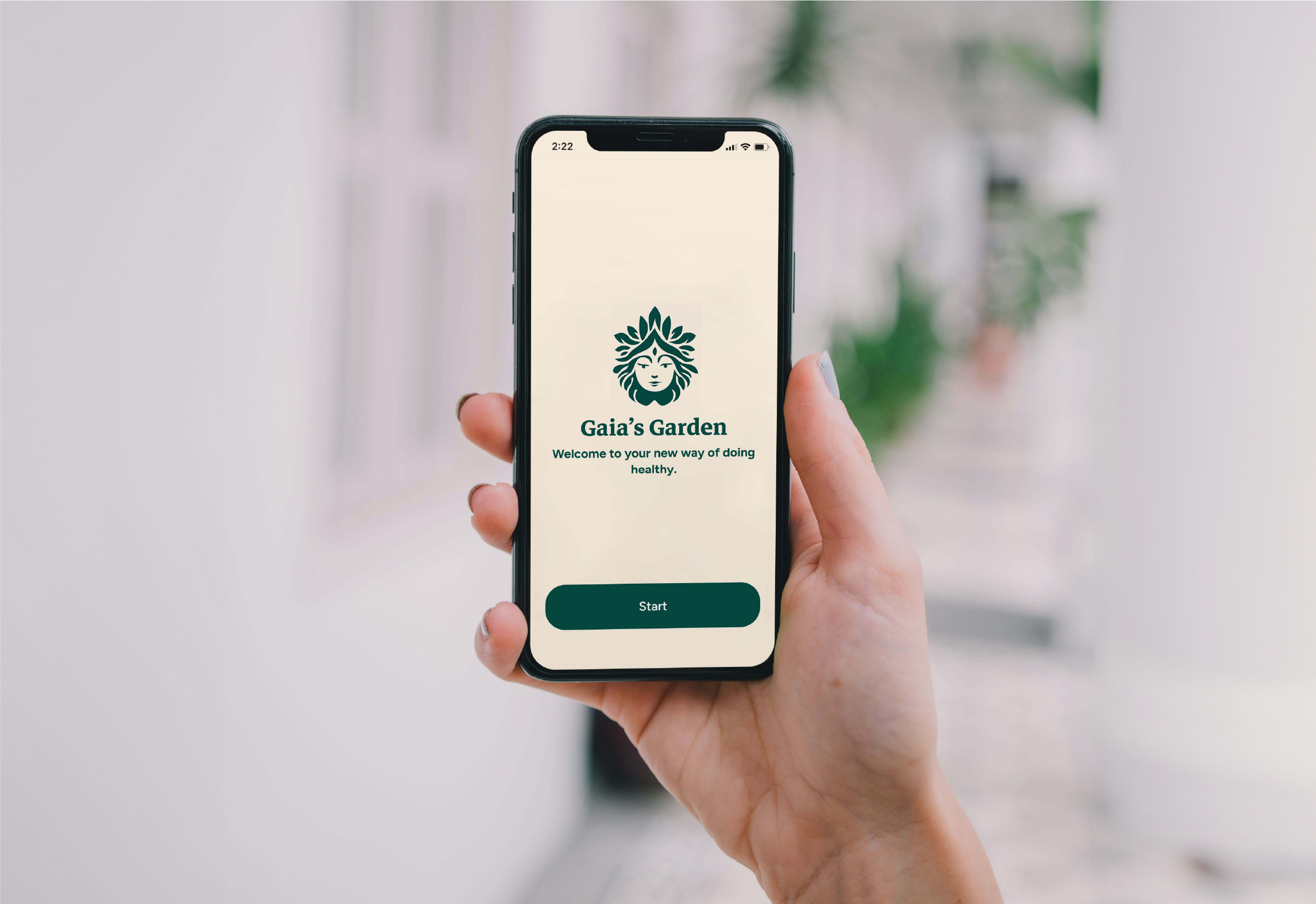
Gaia's Garden
Gaia's Garden is a native mobile app that makes it fast, transparent, and easy to order organic produce and meal kits - sourced directly from local farmers. It bridges the gap between ethical food and modern convenience.
03
The User

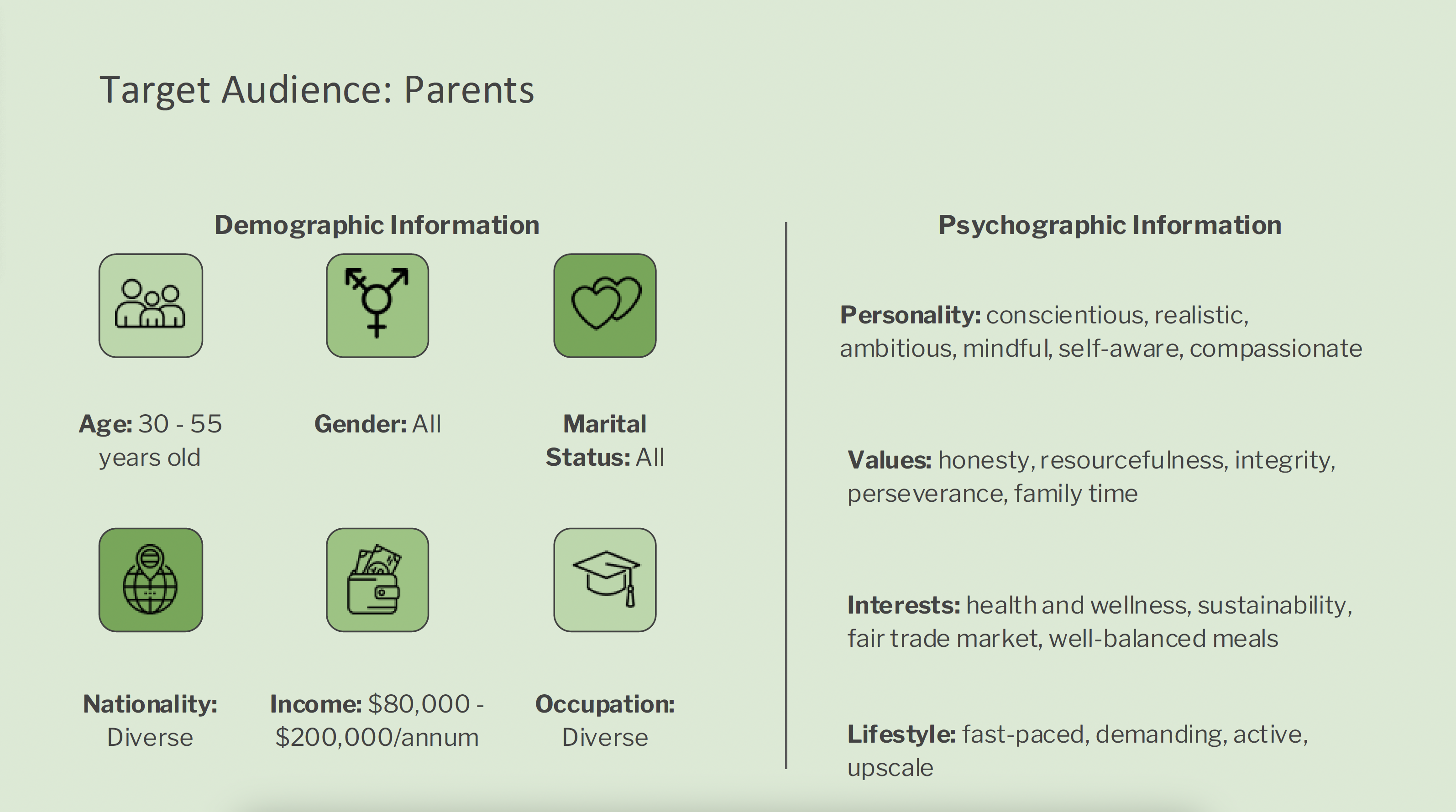
Figure 1 : Target Audience
We developed two distinct user personas to represent the primary users of the platform: working parents (figure 2), and stay-at-home parents (figure 3), to better understand their unique needs and preferences.
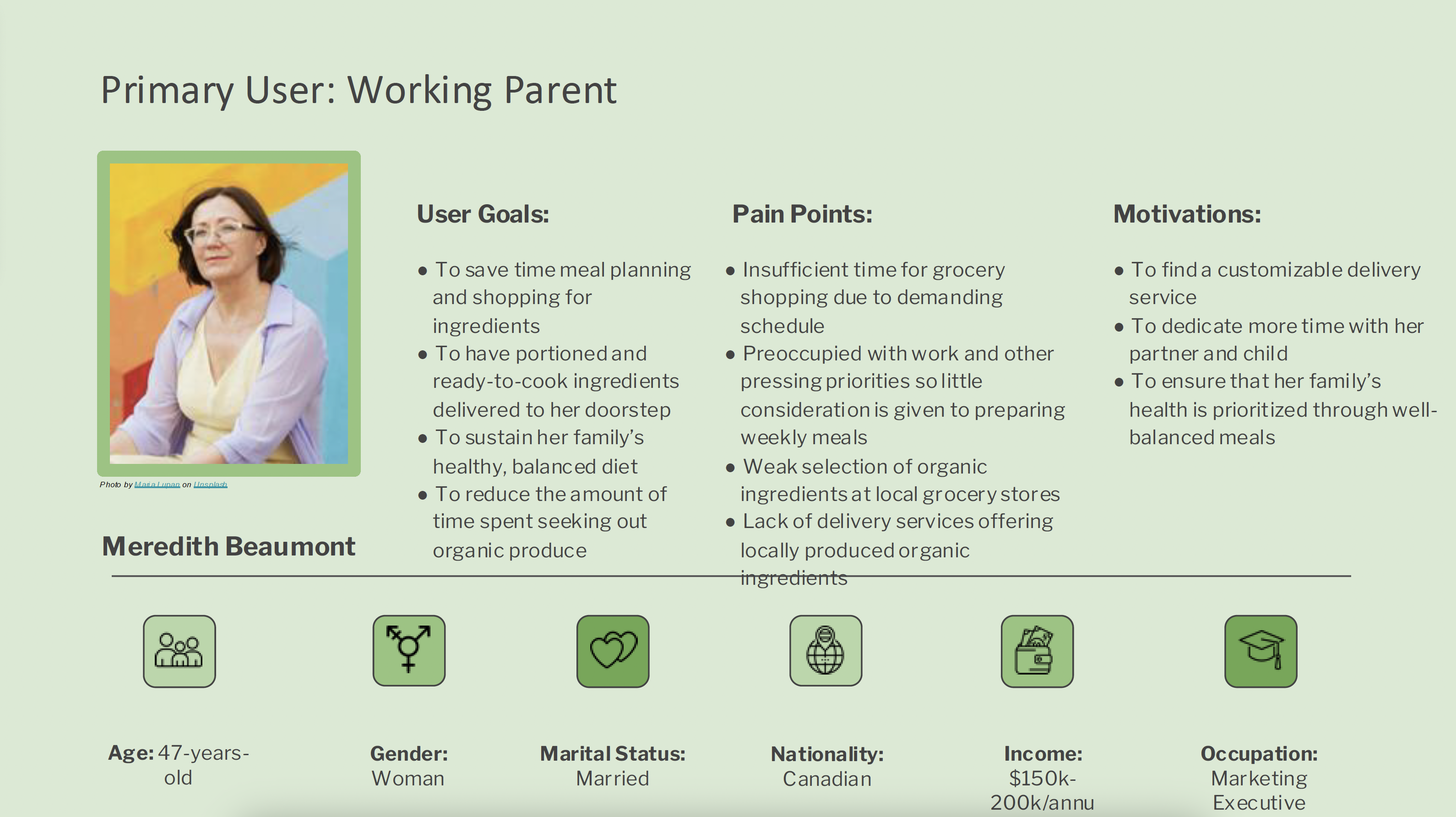
Figure 2 : User Persona #1
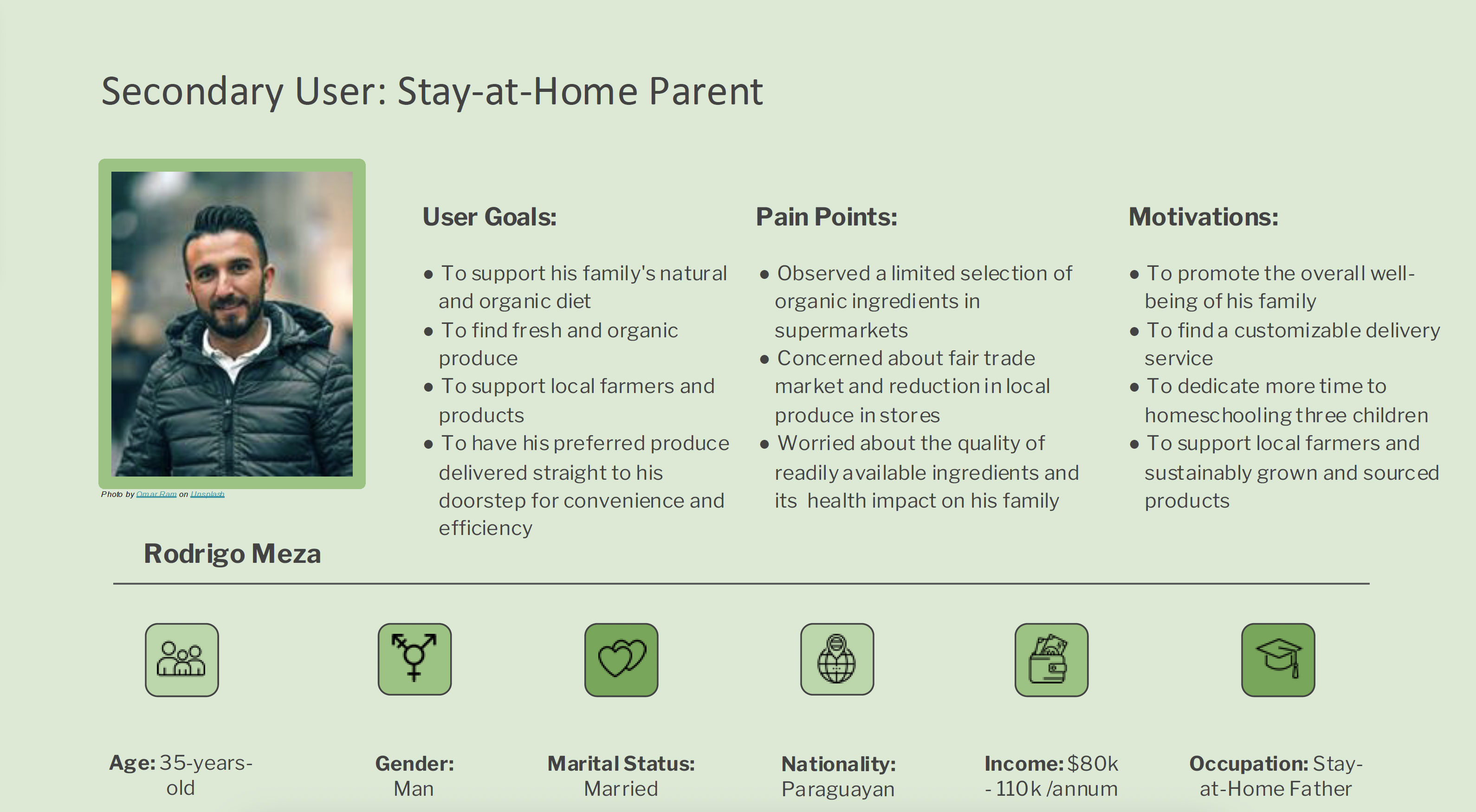
Figure 3 : User Persona #2
The Why, How and When
To create a seamless, intuitive experience, we developed user
journey maps based on Gaia's Garden's primary personas. These
maps visualize each step - from discovering the app and
researching options to placing an order and receiving a delivery
(figure 4: meal boxes, figure 5: organic produce).
This process helped us uncover key touch points, highlight pain
points, and spot opportunities to improve the user experience,
ensuring every step feels tailored, efficient, and satisfying.
Figure 4 : Journey Map #1
Figure 5 : Journey Map #2
04
Research
SWOT Analysis
To position Gaia's Garden effectively, we conducted a SWOT
analysis of key competitors in the organic produce and meal
delivery space (figure 6). This
revealed not only their strengths and weaknesses, but also
gaps and unmet needs Gaia's Garden can address.
Understanding the competitive landscape allowed us to sharpen
our value proposition and identify opportunities to deliver a
more compelling, user-focused experience.
Figure 6 : SWOT Analysis
UI/UX Pattern Analysis
We examined the design patterns of competitor platforms - focusing on key features, navigation flows, and overall usability (figure 7). This analysis provided valuable insights to inform the design of Gaia's Garden and create a smooth, intuitive experience for our users.
Figure 7 : Design Pattern Analysis
05
Brand Spirit
Gaia - The Personification of Earth
We set out to create a digital garden where Canadians feel proud
and connected - connected to their food, their farmers, and
their communities.
How?
A mobile app that's simple, engaging, and built around local
values.
With Gaia's Garden, users can browse and choose local
ingredients, curated meal kits, and seasonal packs, while also
sharing their own recipes and discoveries. Every interaction
adds value to their lives and meaningful support to the farmers
who grow their food. users.
Design System
Gaia's Garden is grounded in four core values:
sustainability, transparency, friendliness, and
warmth.
To bring these to life, we developed a style tile that defines
our colour palette, typography, and iconography (figure 8). This
cohesive visual language ensures a consistent, inviting
experience that reflects our mission whilst fostering a sense of
trust, care, and community.
Figure 8 : Style Exploration
Logo Animation
To infuse Gaia's Garden with more personality, we created a
playful logo animation featuring Gaia giving a
cheeky wink.
This moment adds a touch of sass and reinforces
the brand's friendly, down-to-earth tone. The
wink acts as Gaia's stamp of approval - a fun, reassuring cue
that users are making choices that support their health, the
environment, and their local community.
It's a small detail that builds a stronger emotional
connection while reinforcing the brand's values.
06
Design Process
Defining the User Flow
To ensure a seamless experience, we designed
two user flows
based on Gaia's Garden's primary personas.
Each flow outlines the key steps - from
launching the app to
completing an order - highlighting how
different users navigate the platform to meet their needs
efficiently.
1. Subscribing to a meal kit
(figure 9): This flow focuses on
users subscribing to a weekly meal kit.
2. Subscribing to a produce box
(figure 10): This flow focuses
users subscribing to a produce box.
Figure 9 : User Flow #1 - Subscribing to a meal kit
Figure 10 : User Flow #2 - Subscribing to a produce box
Collaboration Process
Rather than splitting tasks, our team of three chose to
collaborate closely throughout the design process.
Each of us created a low-fidelity homepage wireframe, which we
then reviewed together
(figure 11).
By
analyzing and combining the strongest elements from each
version,
we crafted a cohesive homepage that aligned with Gaia's Garden's
goals, brand vision, and core values, reflecting the strengths
and perspectives of the whole team.
Figure 11 : First iterations of the homepage
Low-Fidelity Wireframes
The consolidated homepage served as our reference point for developing the rest of the app's low-fidelity wireframes, ensuring consistency across all pages (figure 12).
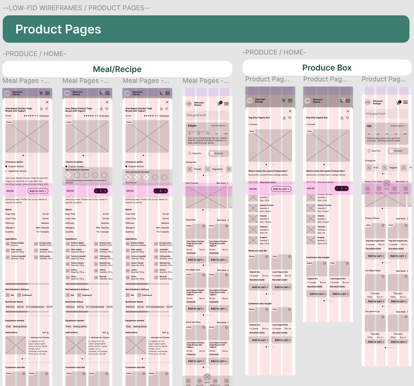
Figure 12 : View our low fidelity wireframes
07
Usability
To validate our design decisions, we conducted usability
testing with three participants, each
completing a series of key tasks:
1. Signing up as a new user
2. Subscribing to a meal kit
3. Purchasing a produce box
We gathered qualitative feedback for each task, helping us
identify usability issues, clarify user expectations,
and uncover opportunities to improve the
overall experience.


100%
participants found the meal selection process to be confusing and overwhelming
100%
participants found some text needed more clarity, such as the difference between meal kits and meal boxes
67%
participants found some icons to be confusing
08
Final Design
Based on peer feedback, we made several rounds of iteration to address common usability issues. These refinements allowed us to refine the user experience, optimize visual elements, and ensure that the final design was both aligned with the brand's identity and functional - delivering a seamless and engaging experience for the users.
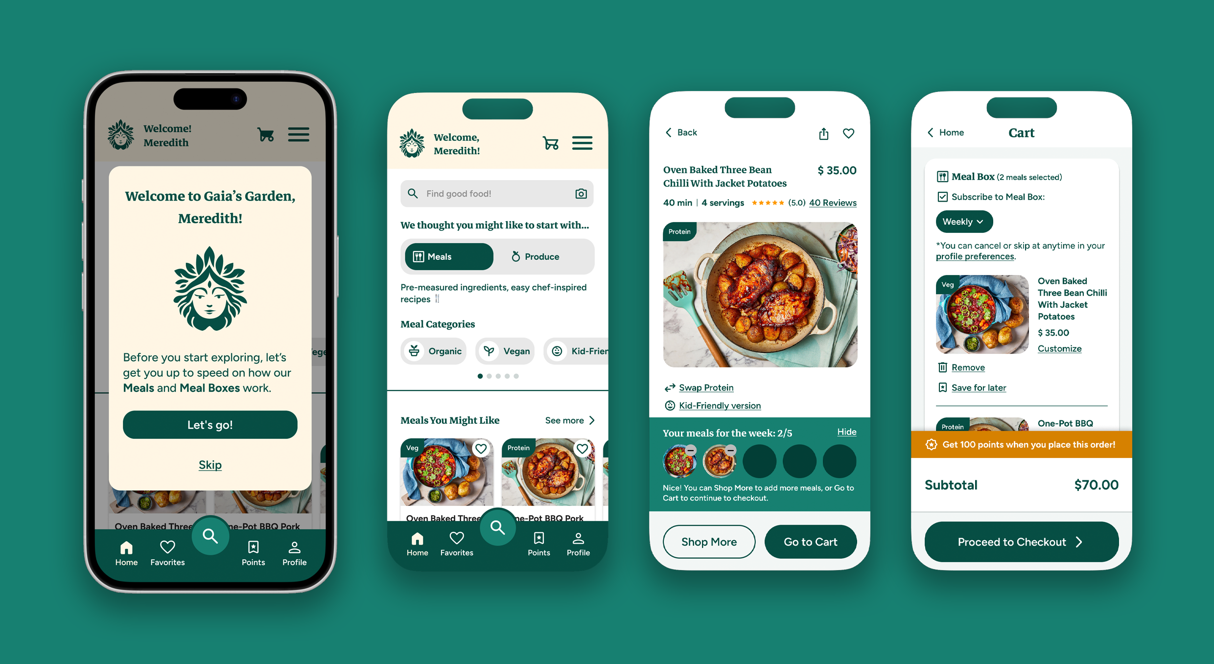
Figure 13 : View our full high fidelity prototype