Places4Students | 2024
ux design
In collaboration with Sarika Bhageratty & Rosa Moriya
Software: Figma, Adobe Illustrator
Duration: 7 weeks
About
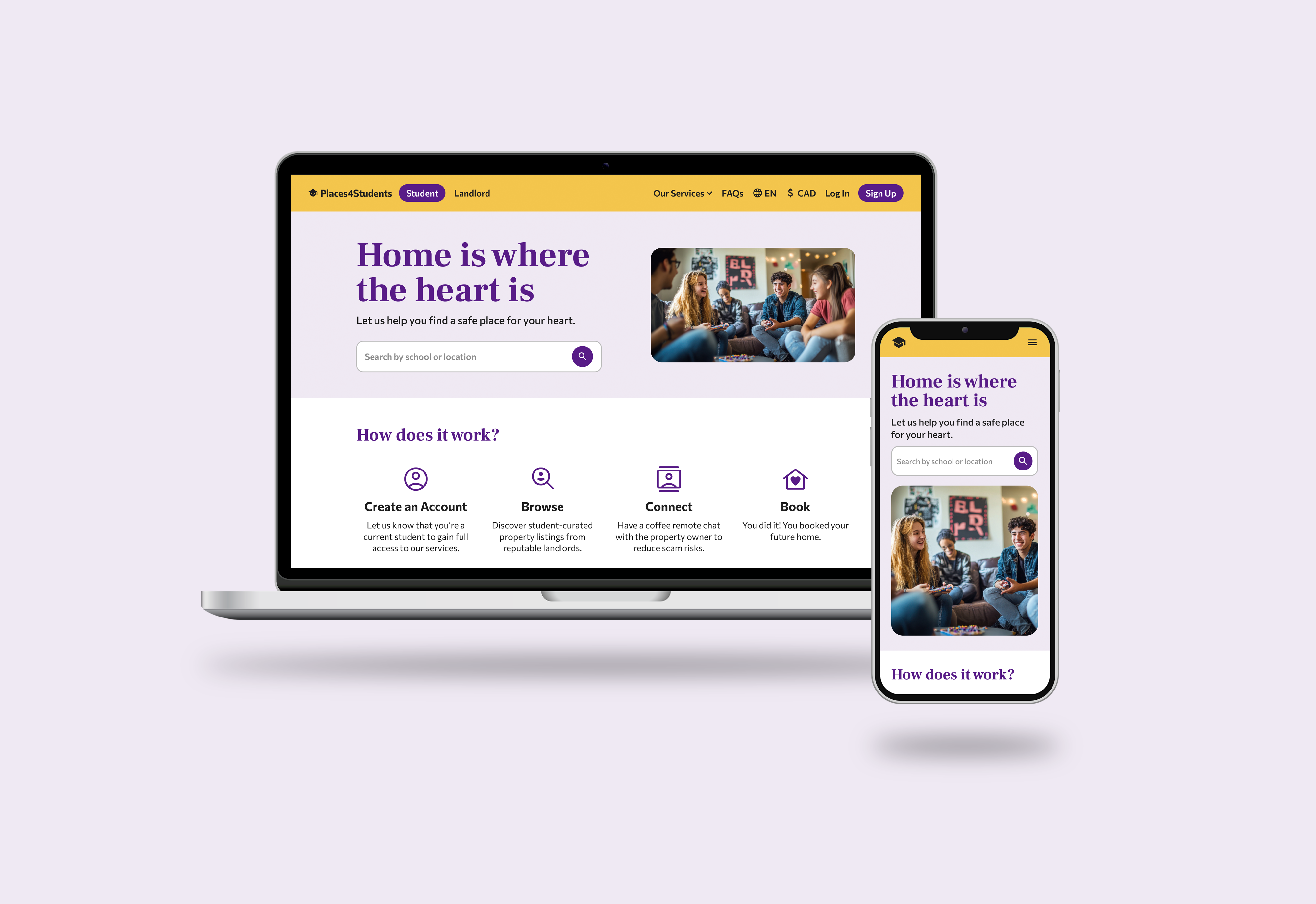
Redesigning the responsive web application, Places4Students, to enhance its user experience by addressing the unique pain points of a specific target audience. The goal is to improve overall functionality while providing a seamless and efficient solution for students seeking housing, making the process easier and more intuitive.
Process
Heuristic Evaluation
To better understand the website experience we conducted a heuristic
evaluation using Nielsen Norman 10 heuristics.
For the purpose of this project we classified and tagged these
heuristics using this table. Then, we used this classification to find
problems throughout the website.
Below is the current Places4Students' website design.

You can view our full Heuristic Evaluation report here.
Style Tile
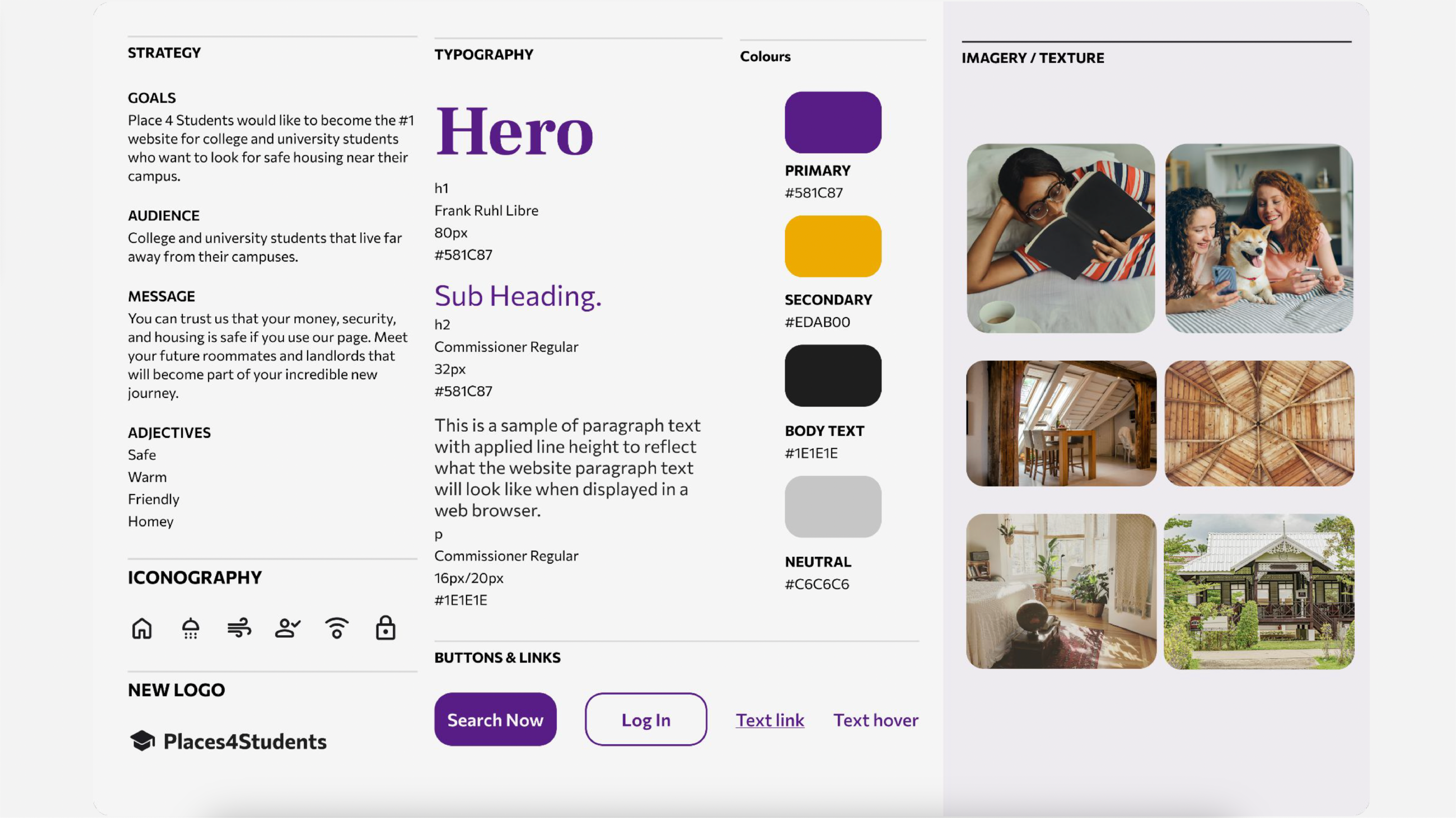
By examining the apps and design patterns commonly used by our target
audience, many of which featured a clean, minimalist aesthetic. We
chose to adopt this approach for our design.
For the color palette, we selected distinctive colors that not
only set the site apart from other housing platforms like Facebook
Marketplace or Zillow but also conveyed a sense of safety, warmth, and
modernity. Instead of the traditional blue for trust and security, we
opted for a bold yet sophisticated purple as the primary color. To
complement this, we paired it with yellow, a warm, inviting color, to
evoke a cozy, friendly, and familiar atmosphere for our users.
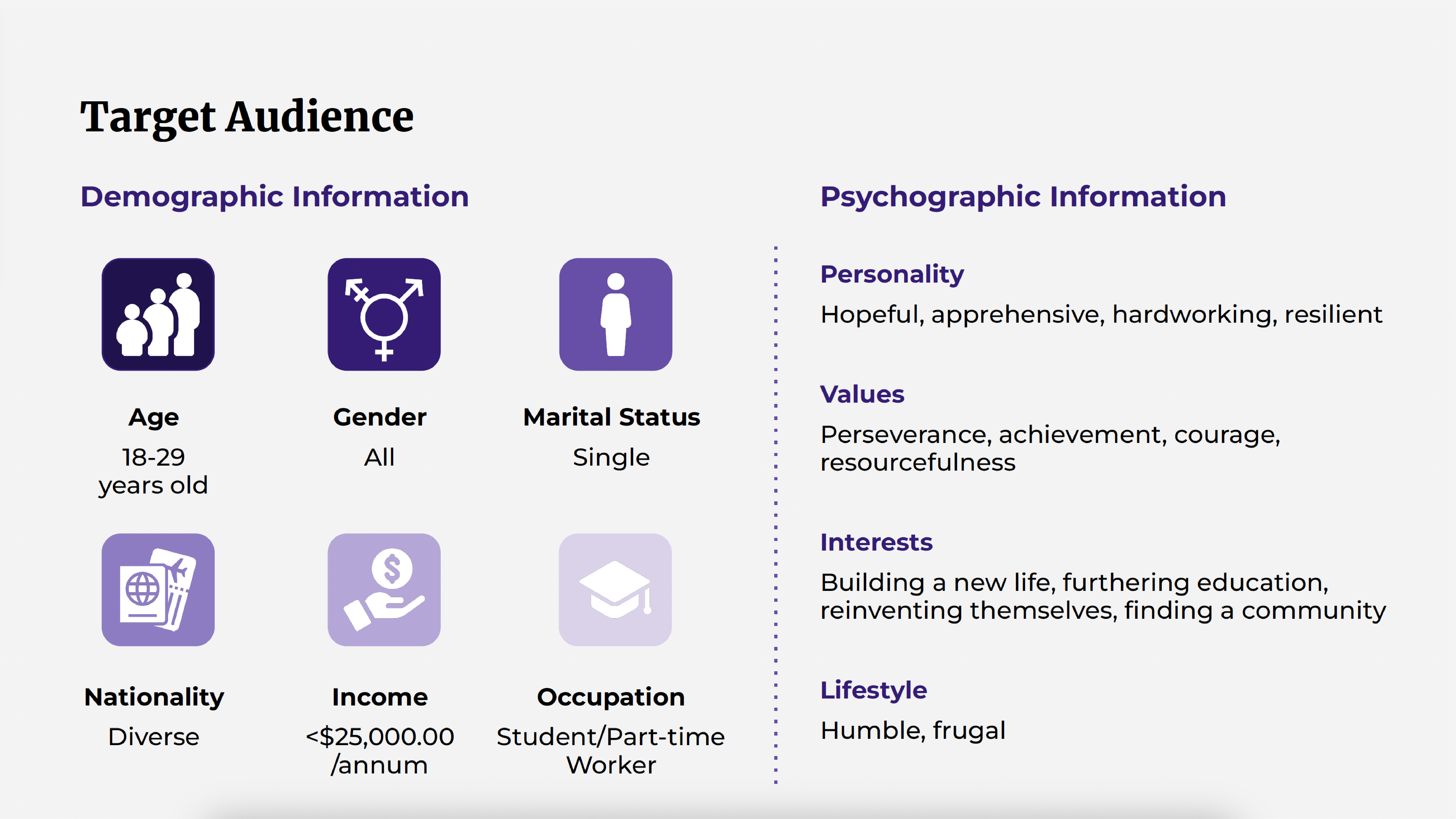
Target Audience
User Personas

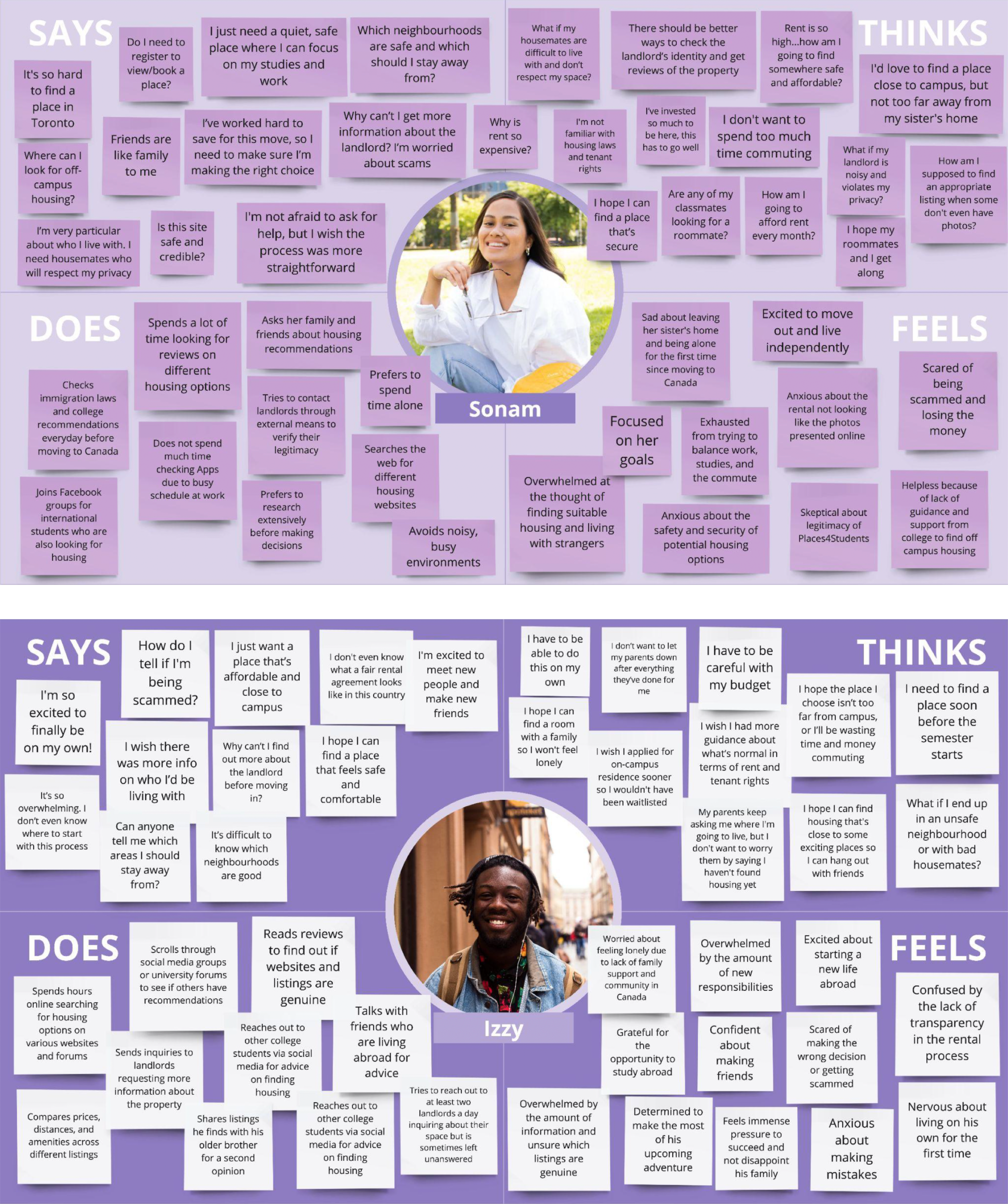
Empathy Maps
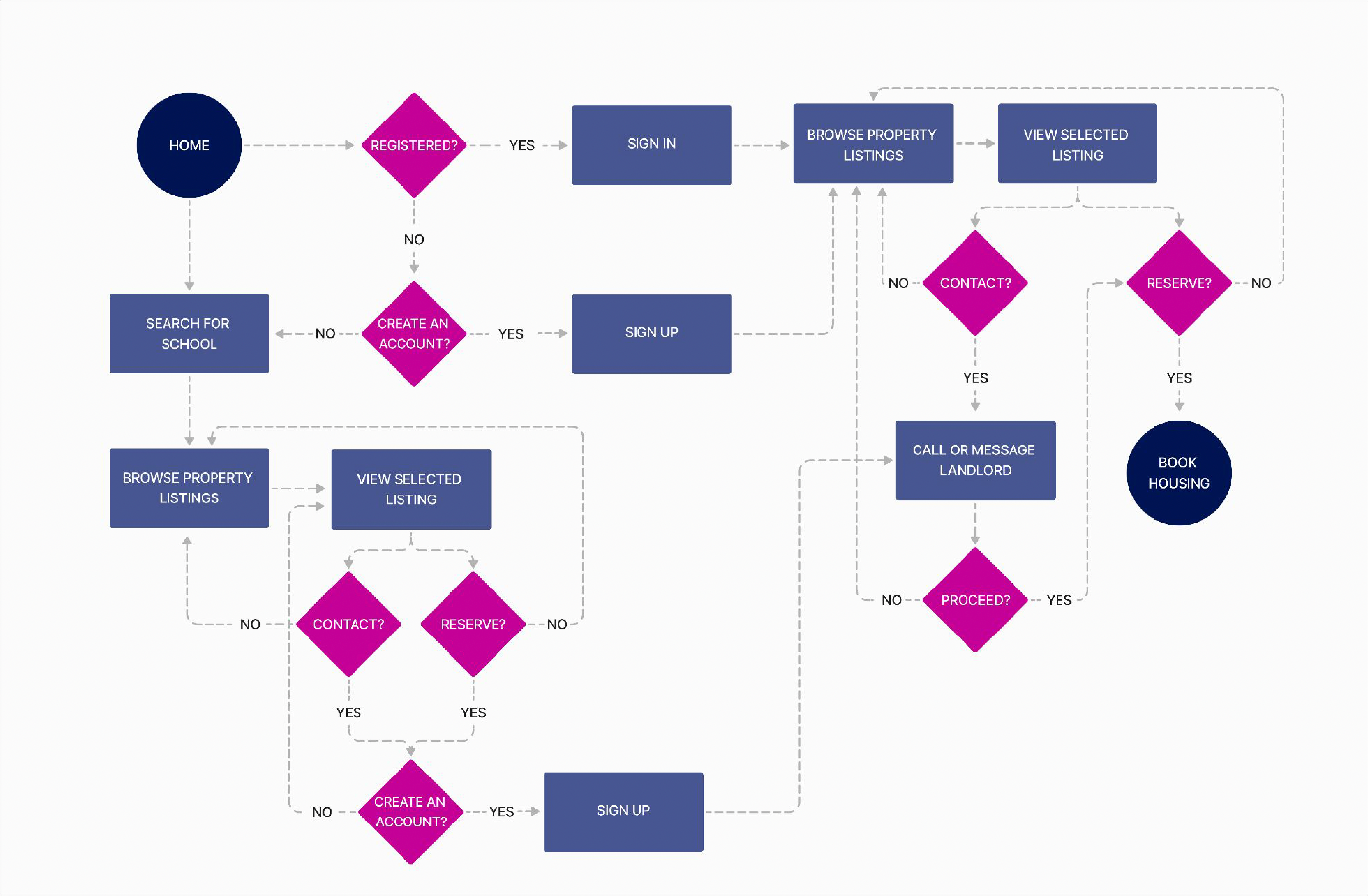
User-Flow Diagrams
The first user-flow diagram illustrates the process for users to book accommodation.
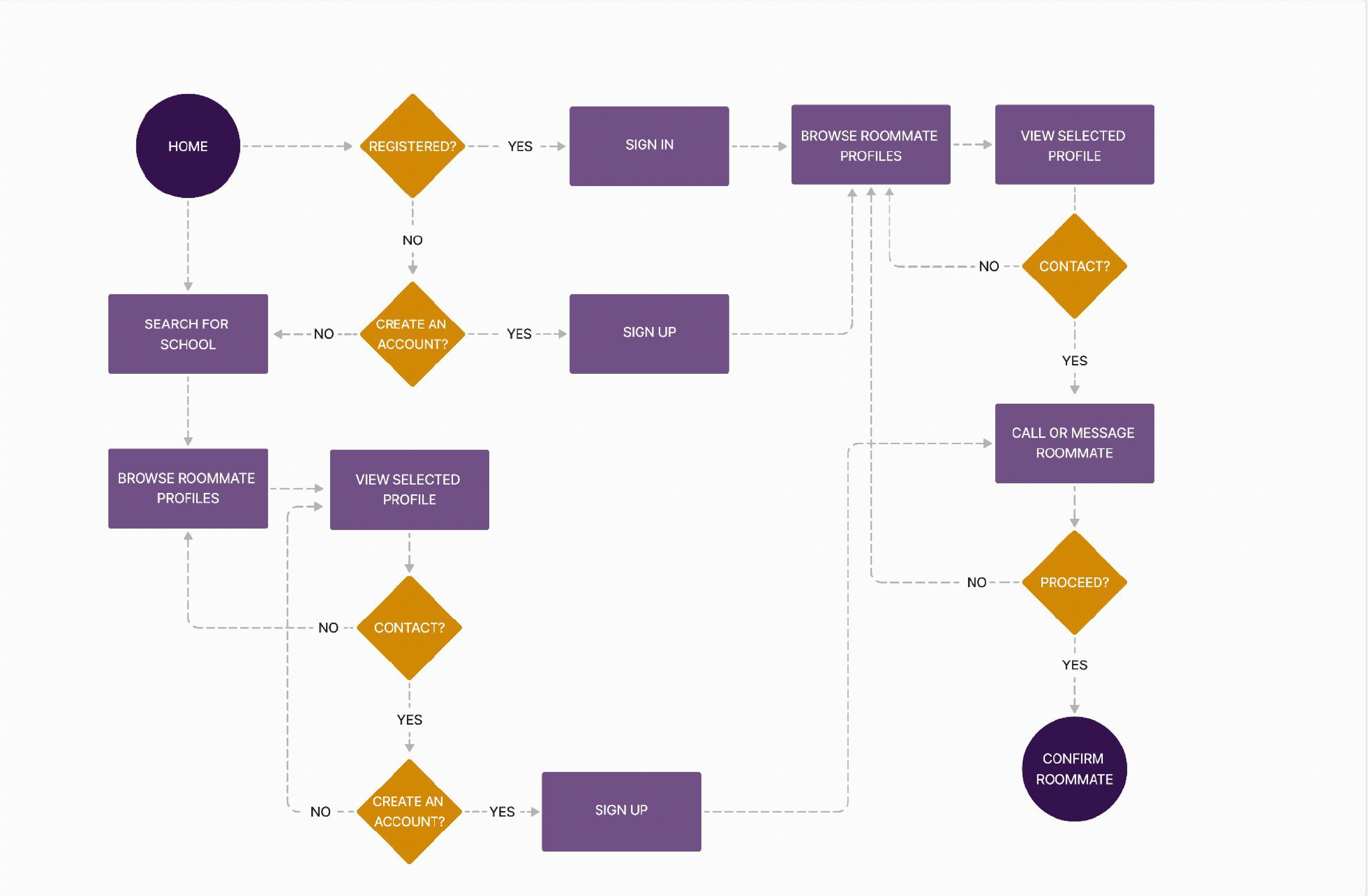
The second user-flow diagram illustrates the process for users to find a roommate.
