COLLABORATORS
Sarika Bhageratty
Rosa Moriya
TOOLS
Figma
Adobe Illustration
DURATION
7 weeks
01
The Problem

What is Places4Students?
Places4Students aims to connect students with rental housing, but its current platform presents several usability challenges.
These challenges?
Students struggle with a cluttered interface, unclear listing details, and a noticeable lack of trust indicators. The outdated design (figure 1) falls short of modern expectations and fails to deliver a seamless, mobile-friendly experience.
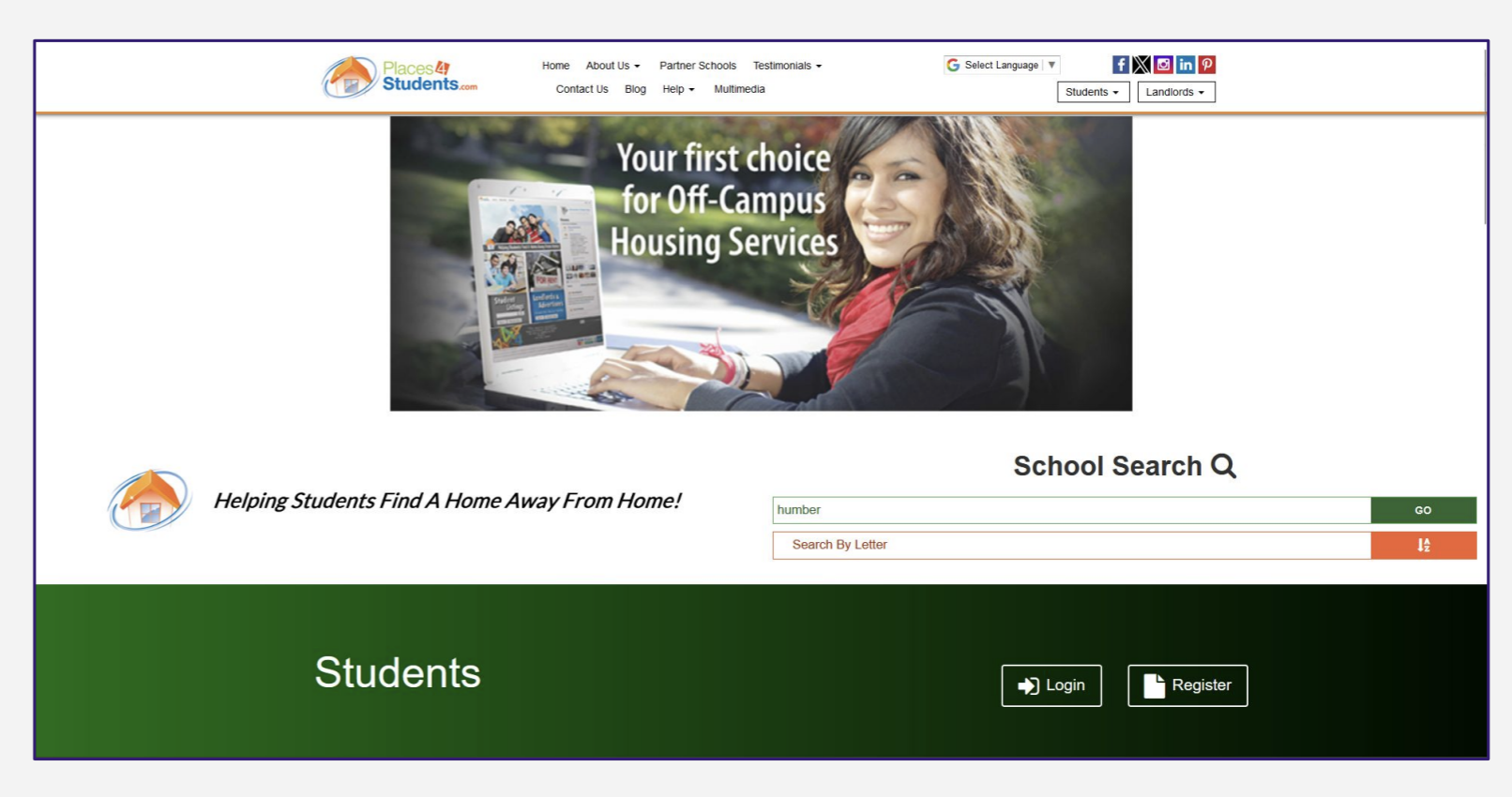
Figure 1 : Current design for Places4Students
For both local and international students, already juggling academics, part-time work, and independent living, the housing search should be simple and stress-free, not an additional source of frustration.
02
The User

Our primary audience was international students searching for off-campus housing (figure 2). Their key concerns centred around ease of search, credibility of listings, and a stress-free decision-making process (figure 3).

Figure 2 : Target Audience
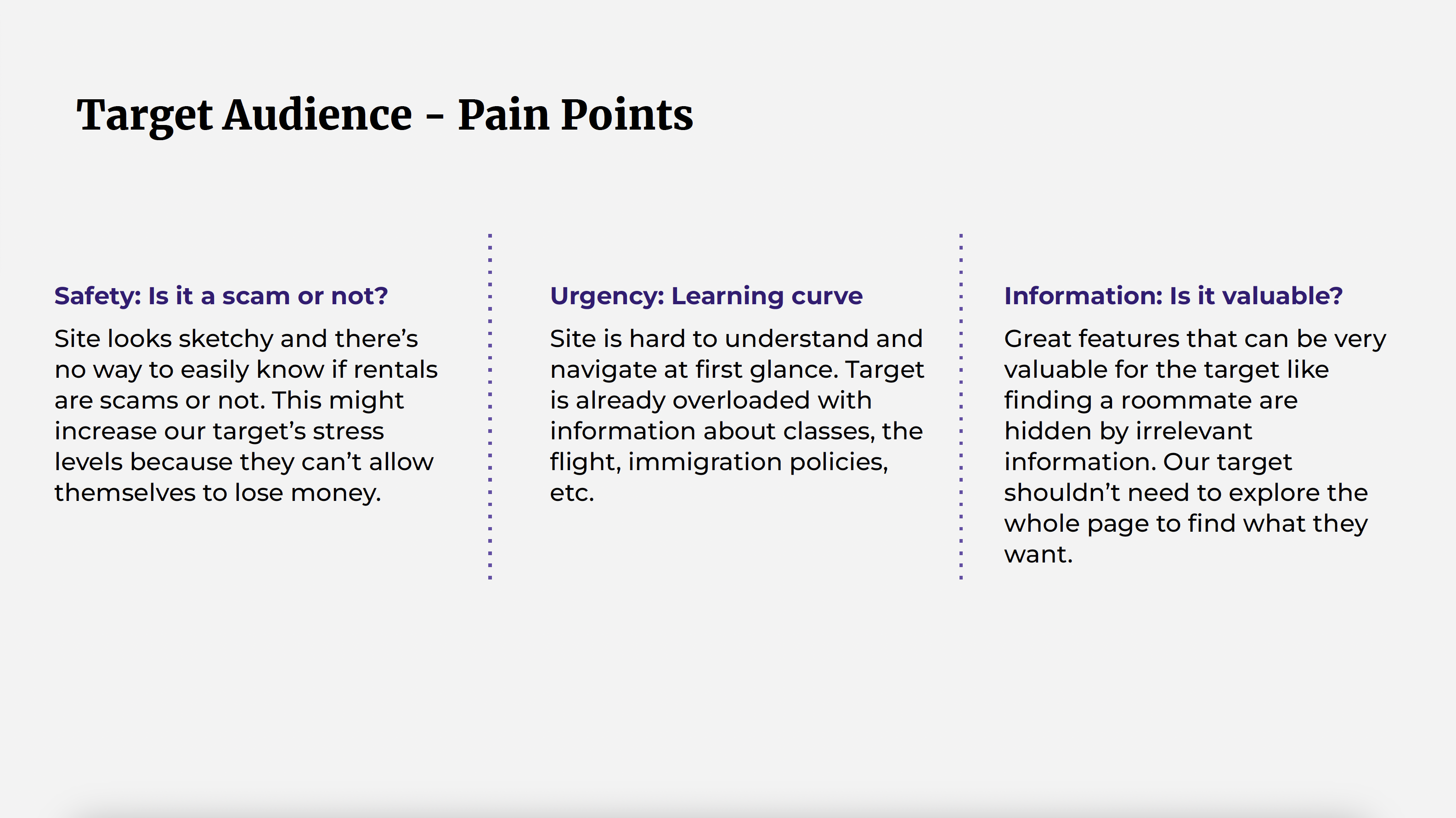
Figure 3 : Target Audience's Pain Points
We created two distinct user personas to represent the
platform's core users:
• students seeking a roommate
(figure 4)
• students searching for off-campus housing
(figure 5)
By understanding their unique goals, frustrations, and
behaviours, we were able to design a more intuitive and
user-centred experience tailored to their needs.
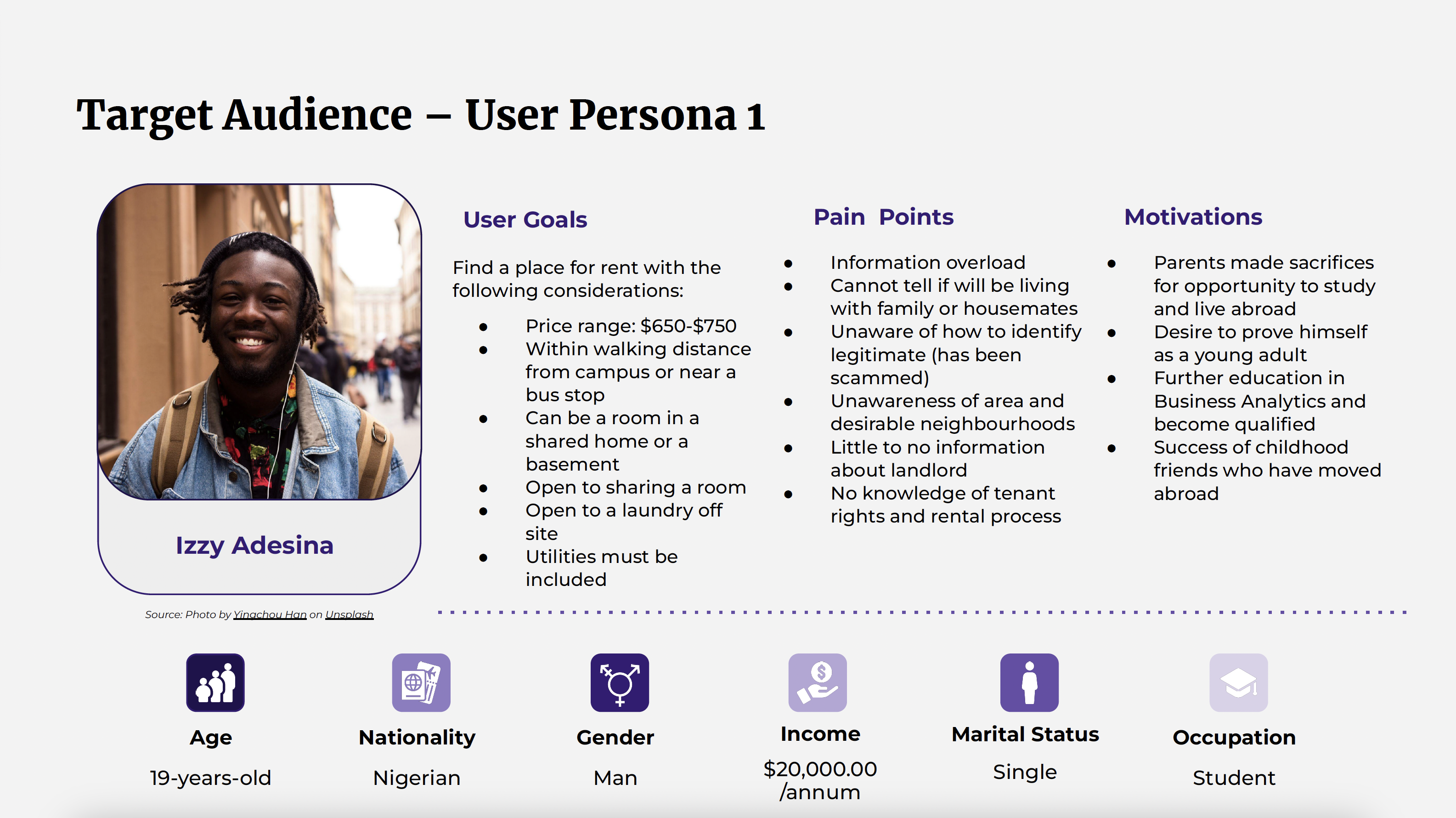
Figure 4 : User Persona #1
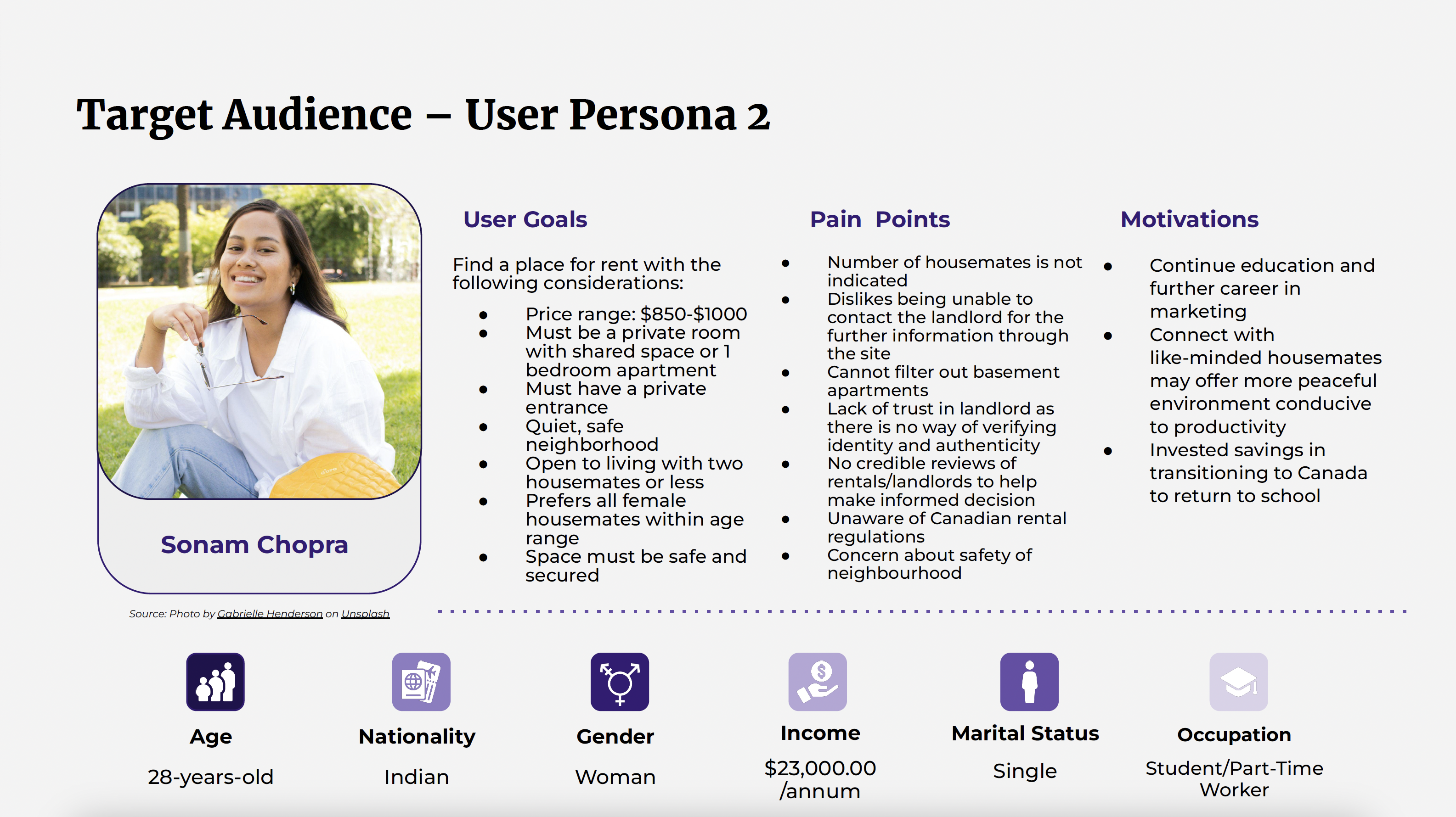
Figure 5 : User Persona #2
Empathy Mapping
To deepen our understanding of user needs, frustrations, and
motivations, we developed empathy maps for both primary user
groups.
For students seeking roommates, the emphasis was on
trust and compatibility. Their
main concerns included finding someone with similar living
habits, avoiding unreliable matches, and
ensuring a safe, respectful, and comfortable living
environment
(figure 6).
For students searching for off-campus housing, key concerns
included
unclear listings, security,
and affordability. Their priority is a
stress-free,
trustworthy platform that offers verified
information and a straightforward process, empowering them to
make confident housing decisions
(figure 7).
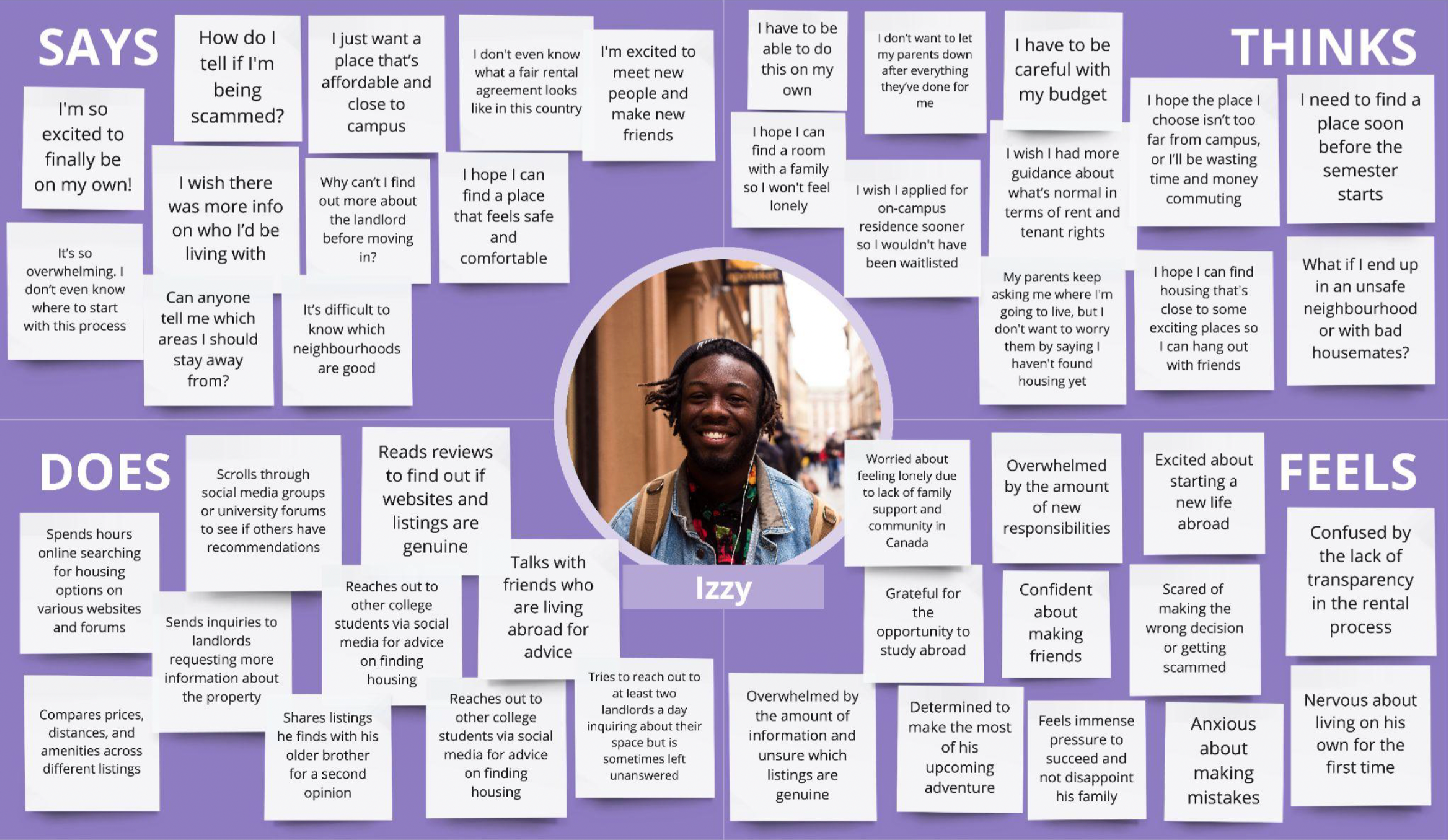
Figure 6 : Empathy Map #1
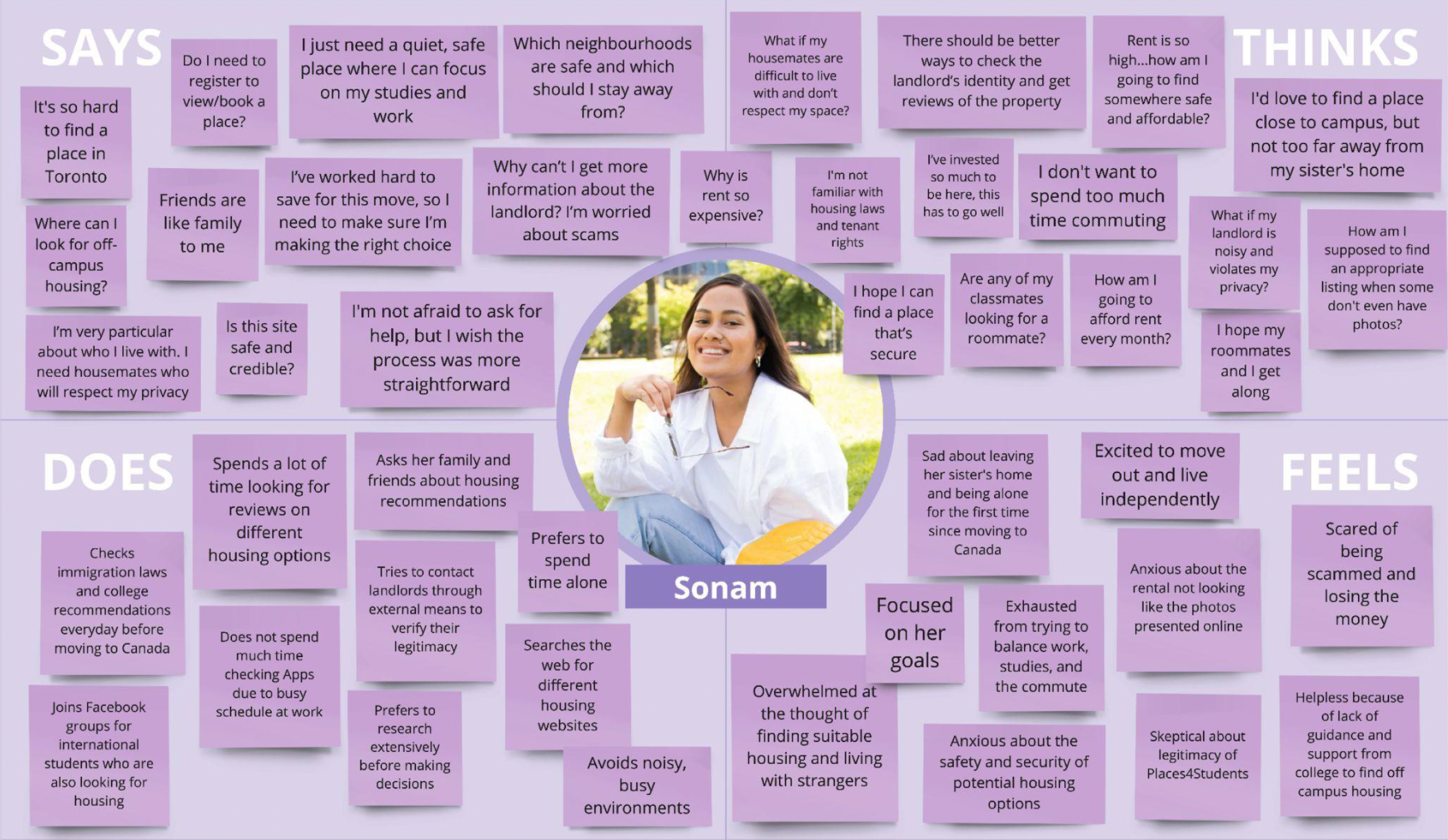
Figure 7 : Empathy Map #2
03
Design Process
Heuristic Evaluation
We conducted a heuristic evaluation using Nielsen Norman's 10 usability heuristics to identify usability issues. Each heuristic was classified and tagged to pinpoint specific problem areas within the website (figure 8), which helped guide our redesign strategy.
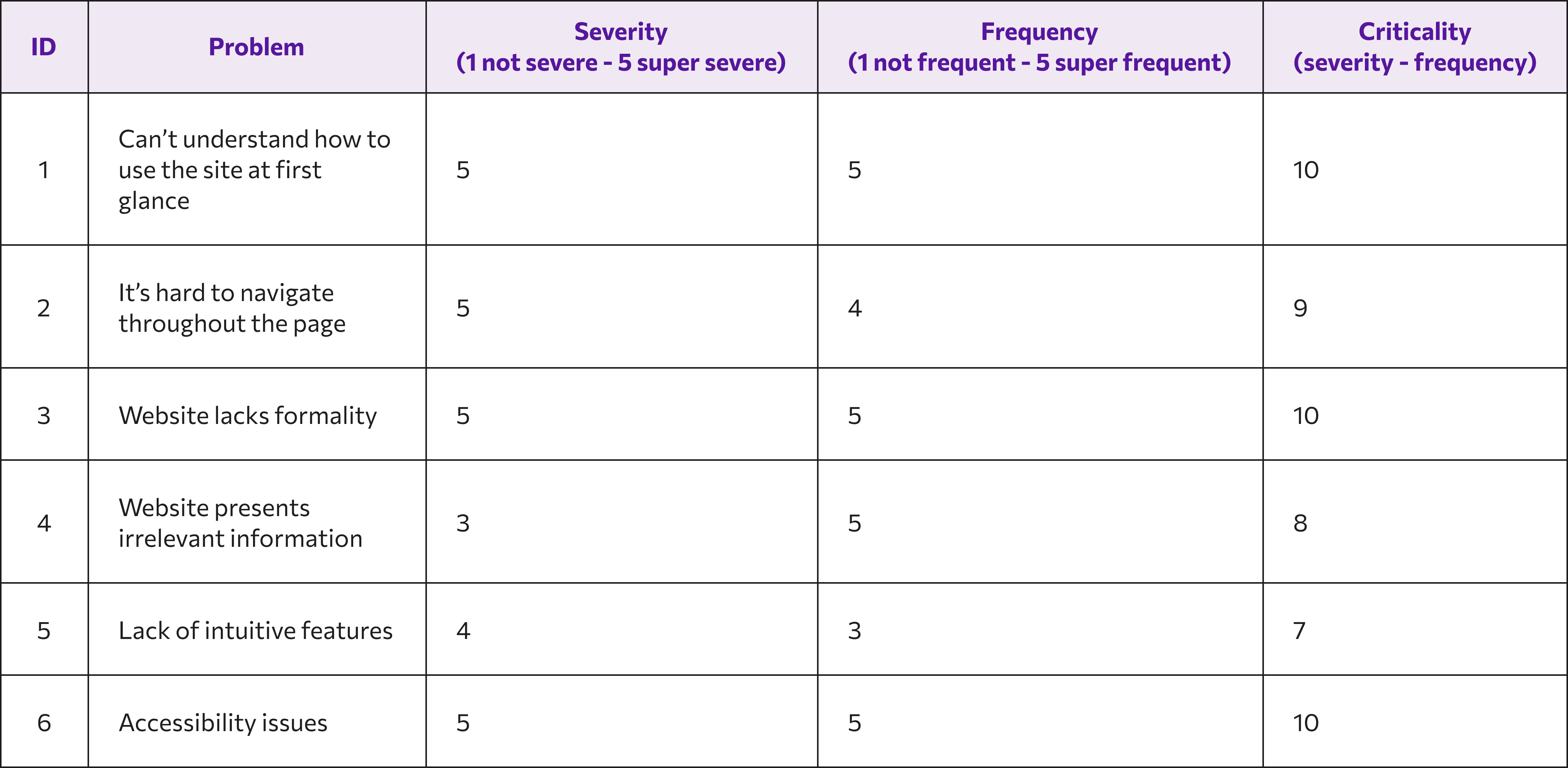
Figure 8 : Read our full Heuristic Evaluation report
Visual Design & Brand Identity
After analyzing apps and design patterns familiar to our target audience, we noticed a strong preference for clean, minimalist aesthetics. This insight informed our own design direction (figure 9), leading us to adopt a similarly modern and intuitive visual style.
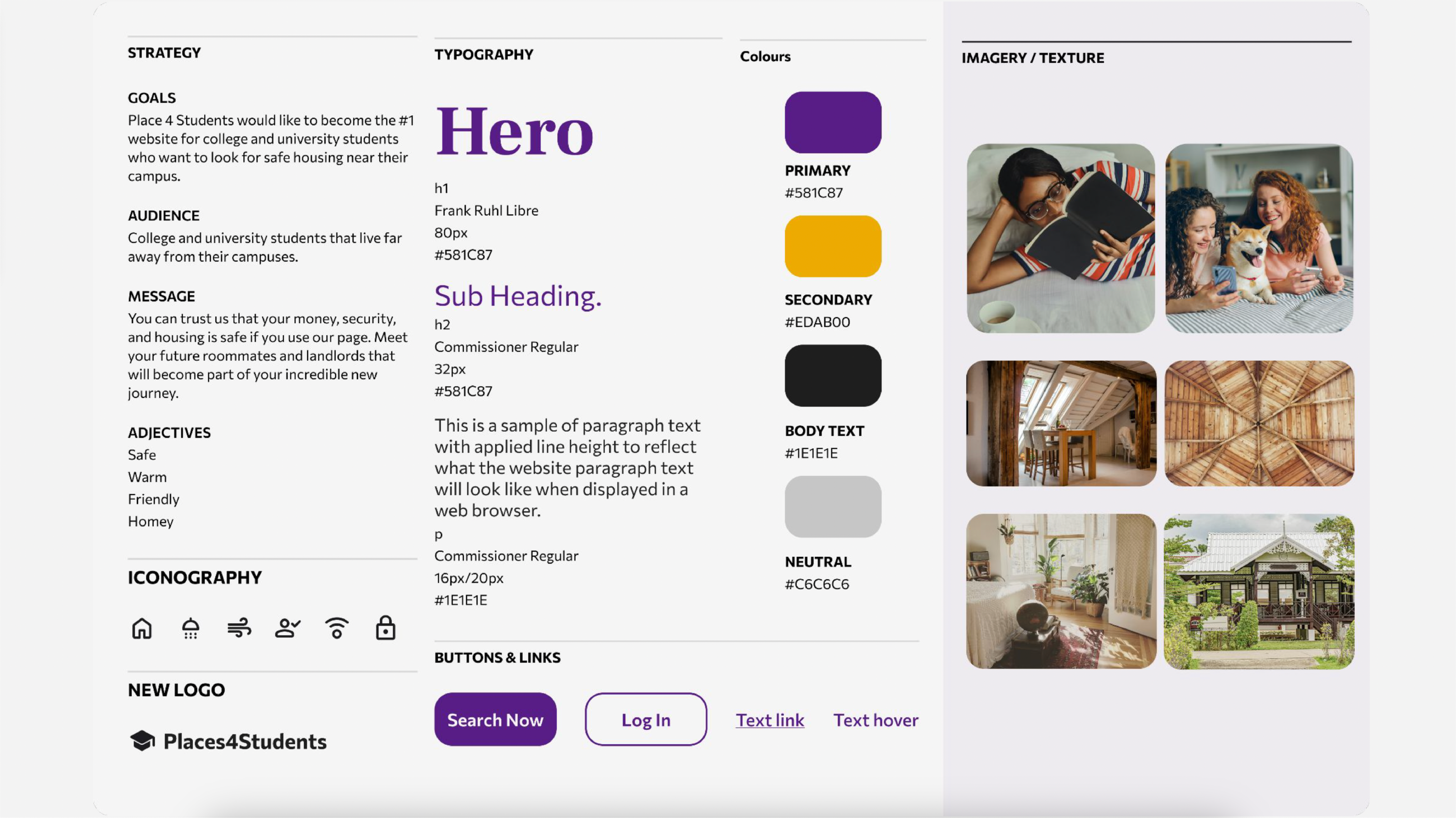
Figure 9 : Style Tile
Colour Palette
To stand out from platforms like Facebook Marketplace and
Zillow, while also conveying safety, warmth, and modernity, we
carefully selected a distinctive colour scheme:
• Primary Colour: Instead of the conventional “trust blue,” we
chose a bold yet
sophisticated purple to signal both
credibility and freshness.
• Secondary Colour: A warm,
inviting yellow complements the purple, evoking
a sense of coziness,
friendliness, and
familiarity for student users.

Defining the User Flow
We designed two distinct user flows to address the platform's
core use cases:
• Students searching for off-campus housing
(figure 10)
• Students looking for a compatible roommate
(figure 11)
By tailoring the experience to these specific goals, we created
a more intuitive and
efficient navigation process for each user
type.
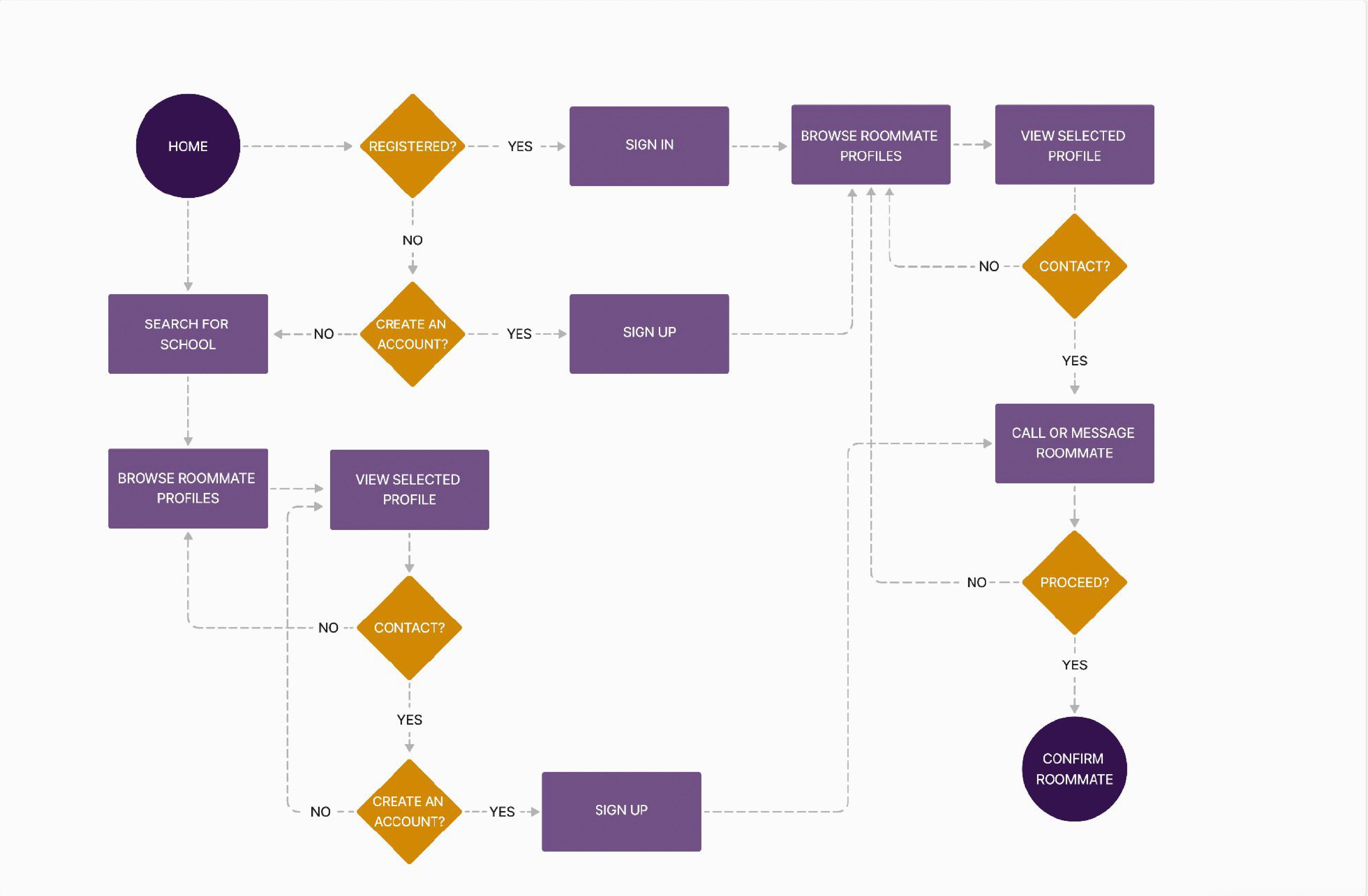
Figure 10 : User Flow #1 - Finding a Roommate
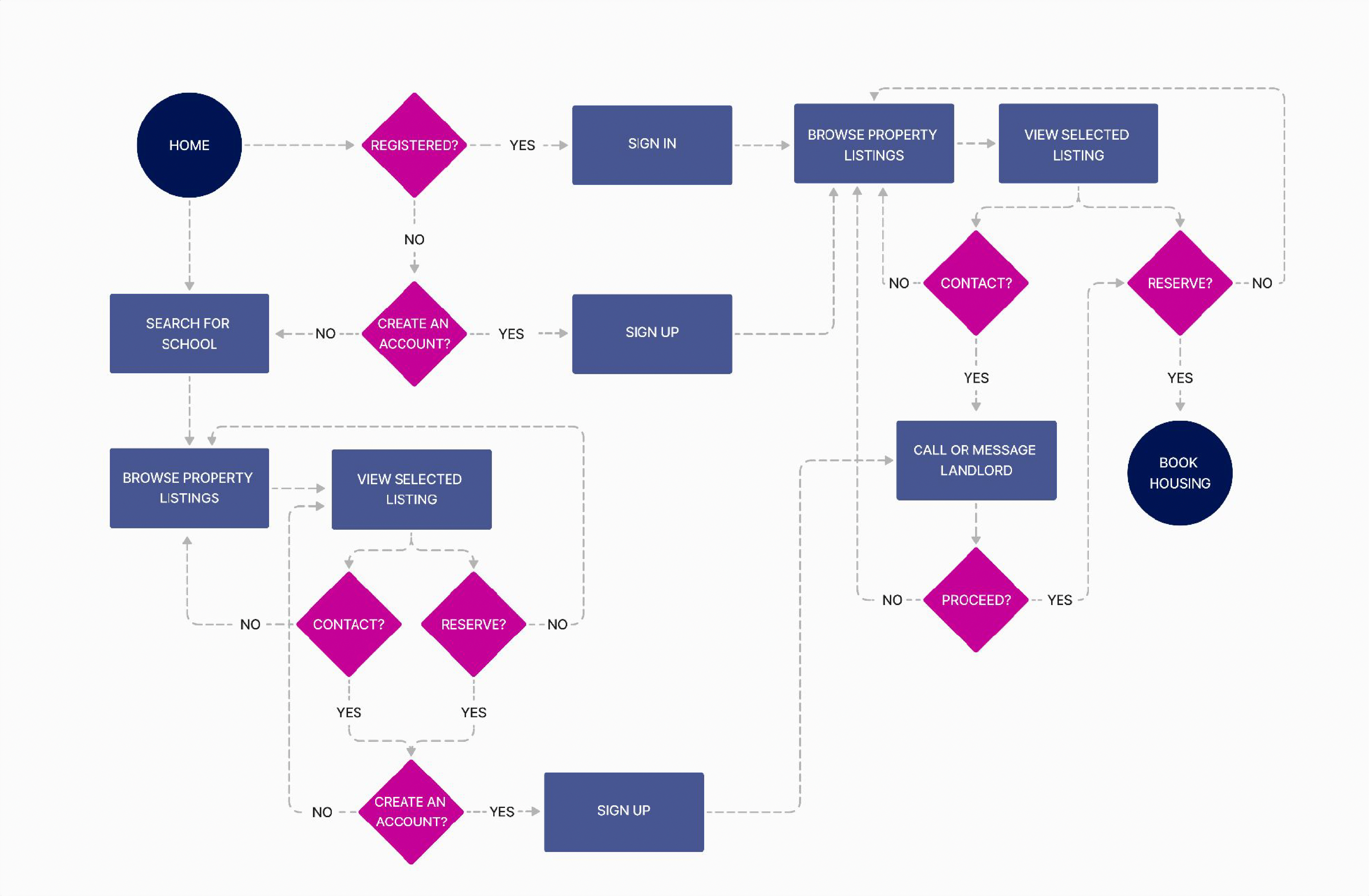
Figure 11: User Flow #2 - Finding Housing
Collaborative Design Approach
Since we were a group of three, we had to decide how to divide
the tasks efficiently.
Our solution was not to. Instead of working
individually on separate tasks, we collaborated in real time to
ensure a collective vision. We hopped on a call
and gave ourselves one hour to individually design a
low-fidelity wireframe for the homepage
(figure 12). Once the time was
up, we presented our concepts, analyzed each design, and
selected the strongest elements that best aligned with the
project's goals.
By consolidating our ideas, we crafted a single,
well-rounded homepage that combined our collective insights
and strengths
(figure 13).
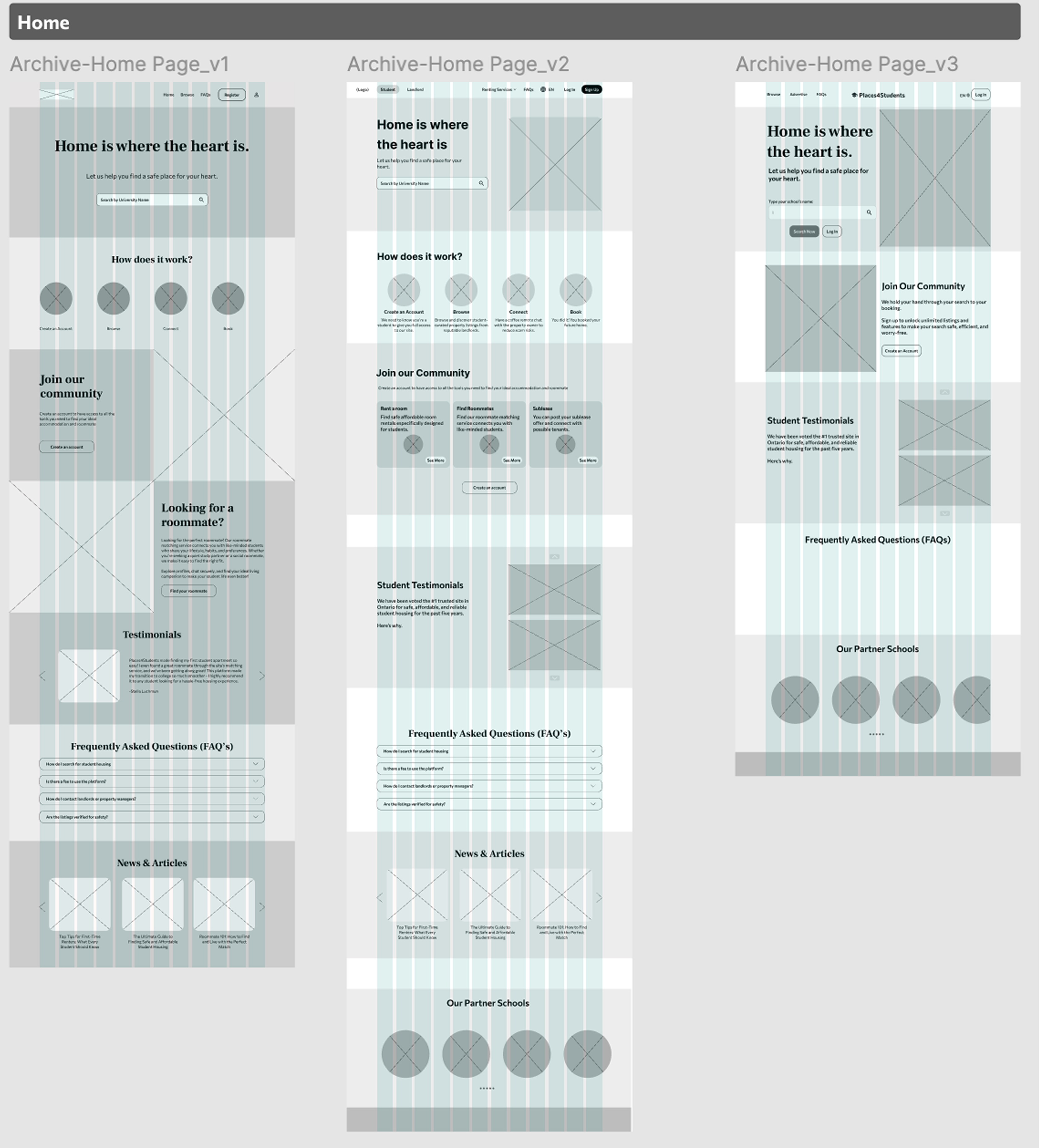
Figure 12 : Individual Wireframess
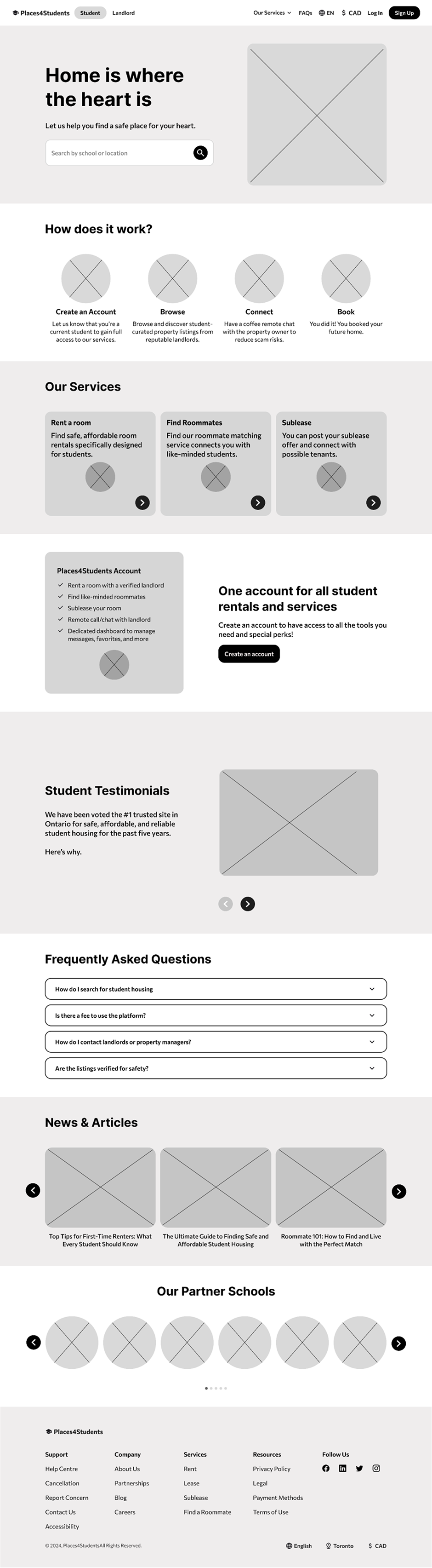
Figure 13 : Consolidated Homepage
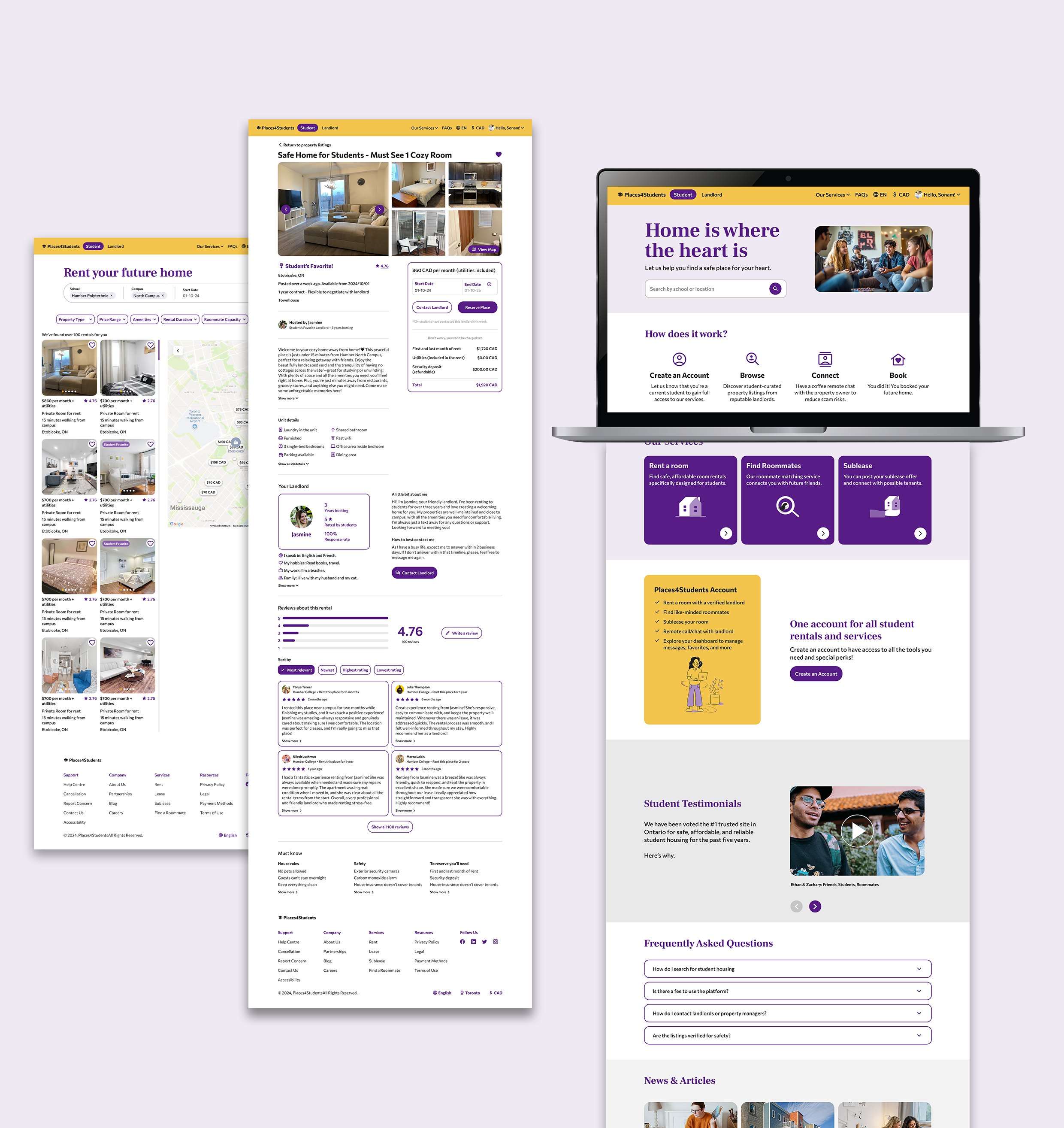
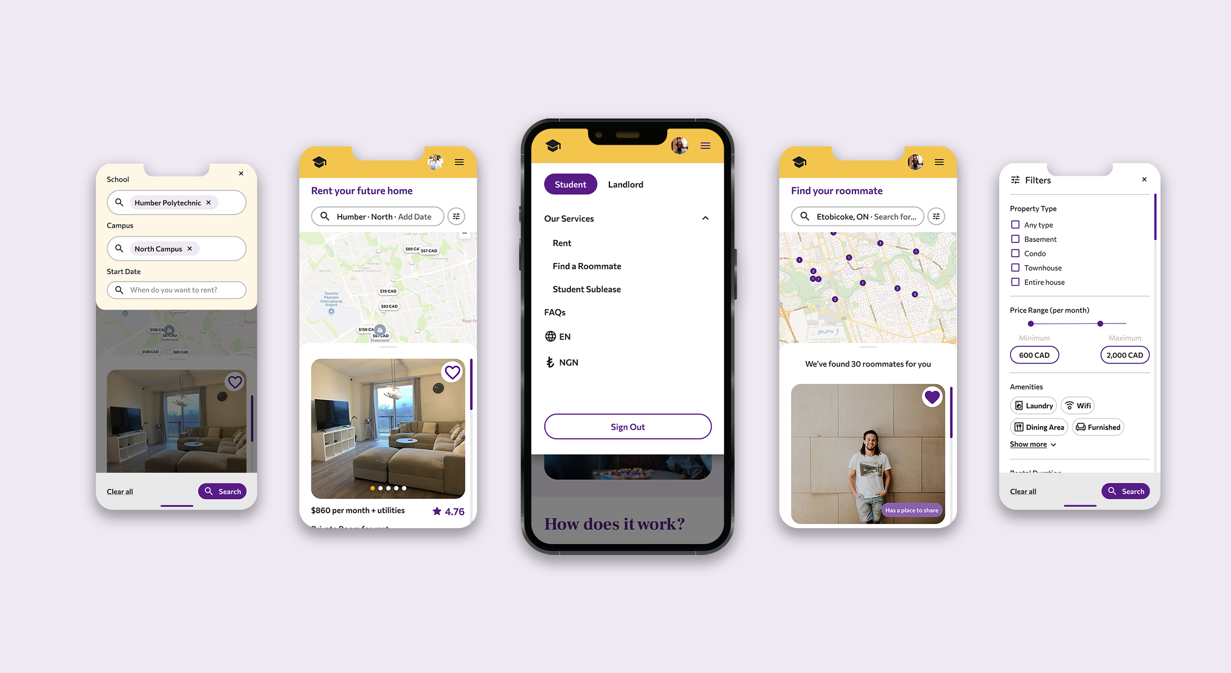
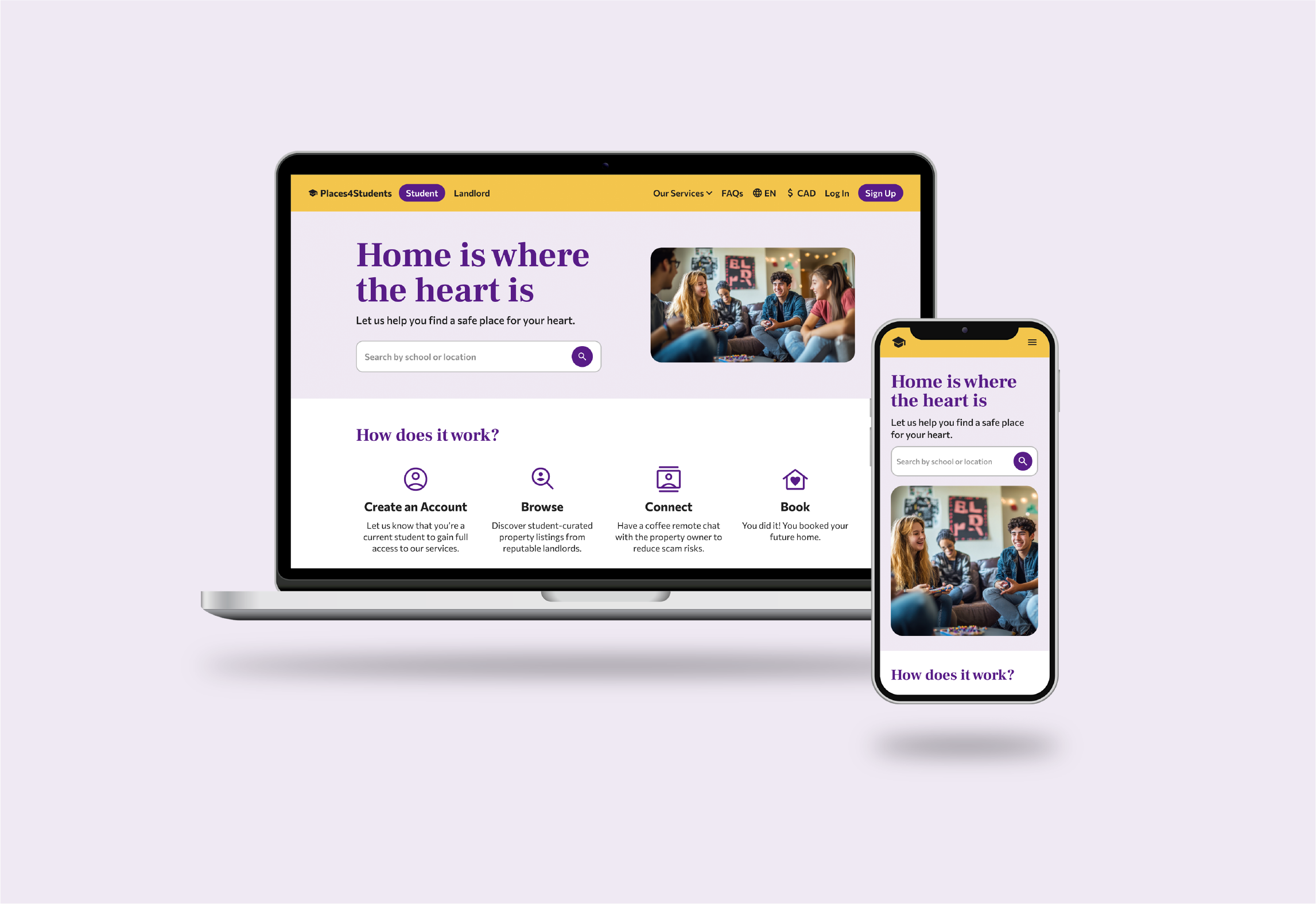
The consolidated homepage served as our reference point for developing the rest of the website's low-fidelity wireframes, ensuring consistency across both desktop and mobile versions (figure 14).
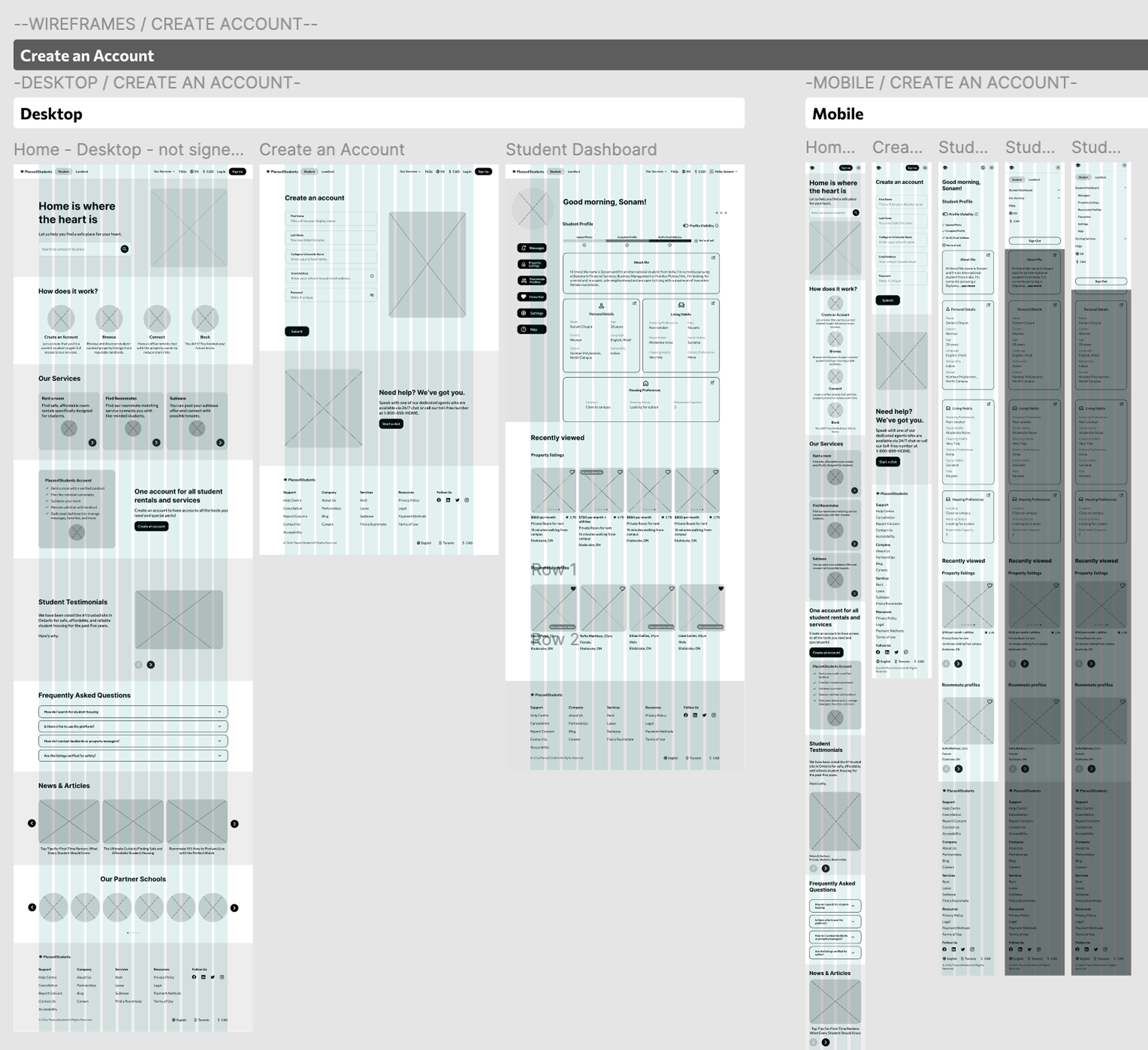
Figure 14 : Low-fidelity wireframes
04
Usability
During the usability testing, we gathered feedback from four participants, analyzing their responses in relation to the four key issues identified during our heuristic evaluation of the original Places4Students website.


50%
participants were confused with certain terms used throughout the website.
75%
participants were initially confused about where to find the roommate feature and suggested double-parking the link.
05
Final Design
Based on peer feedback, we made several rounds of iteration to address common usability issues. These refinements allowed us to refine the user experience, optimize visual elements, and ensure that the final design was both aligned with the brand's identity and functional - delivering a seamless and engaging experience for the users.