


PROJECT TYPE
Self-directed
TOOLS
Adobe Illustration
Adobe After Effects
Figma
Blender
DURATION
7 weeks
01
Overview

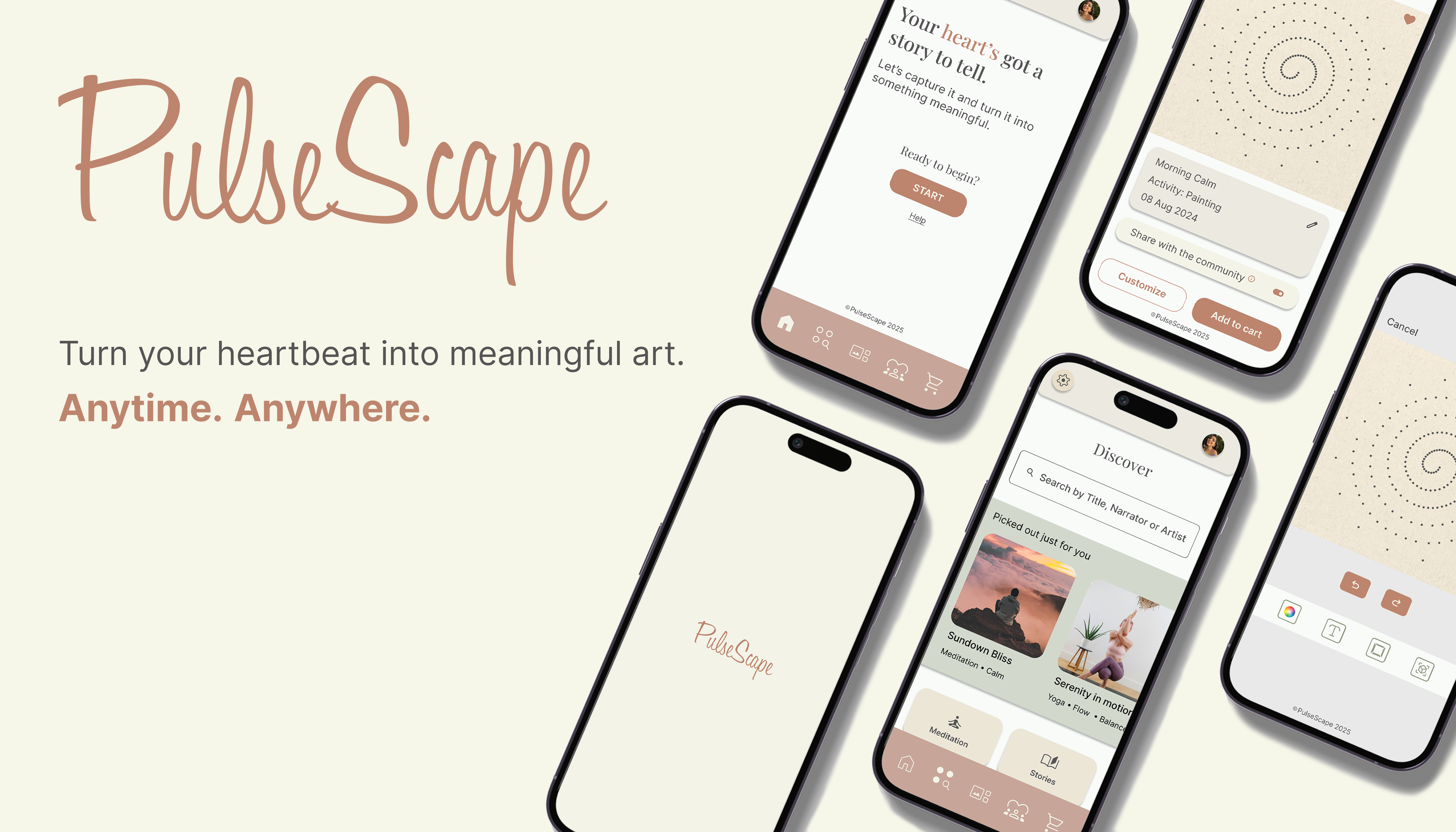
PulseScape is a native app designed to transform everyday activities into unique, personalized artwork by analyzing heart rate data and translating it into visual representation of how these activities influence users' emotions.

Defining PulseScape as a wellness app
Heart rates can reflect our emotions. The idea of using heart
rates to depict one's emotional state comes from the fact that a
heartbeat is something we cannot consciously control.
Changes in heart rate are not only based on physical changes but
also
closely connected to how we feel emotionally and
mentally.
The way our heart works can affect our emotions, and how we feel
emotionally can also change our heart rate. Understanding this
connection is important for understanding mental health
(Mesa, 2023).
Our heart rates can capture how we feel and are necessary for
functioning.
 Living.
02
The User
For this app, I aimed to explore two distinct target audiences:
• individuals interested in mindfulness
(figure 1)
•individuals seeking a convenient way to find meaningful gifts
(figure 2)
By addressing these diverse user needs, the app concept blends
self-care and
thoughtful gifting into a cohesive experience
to cater different needs.
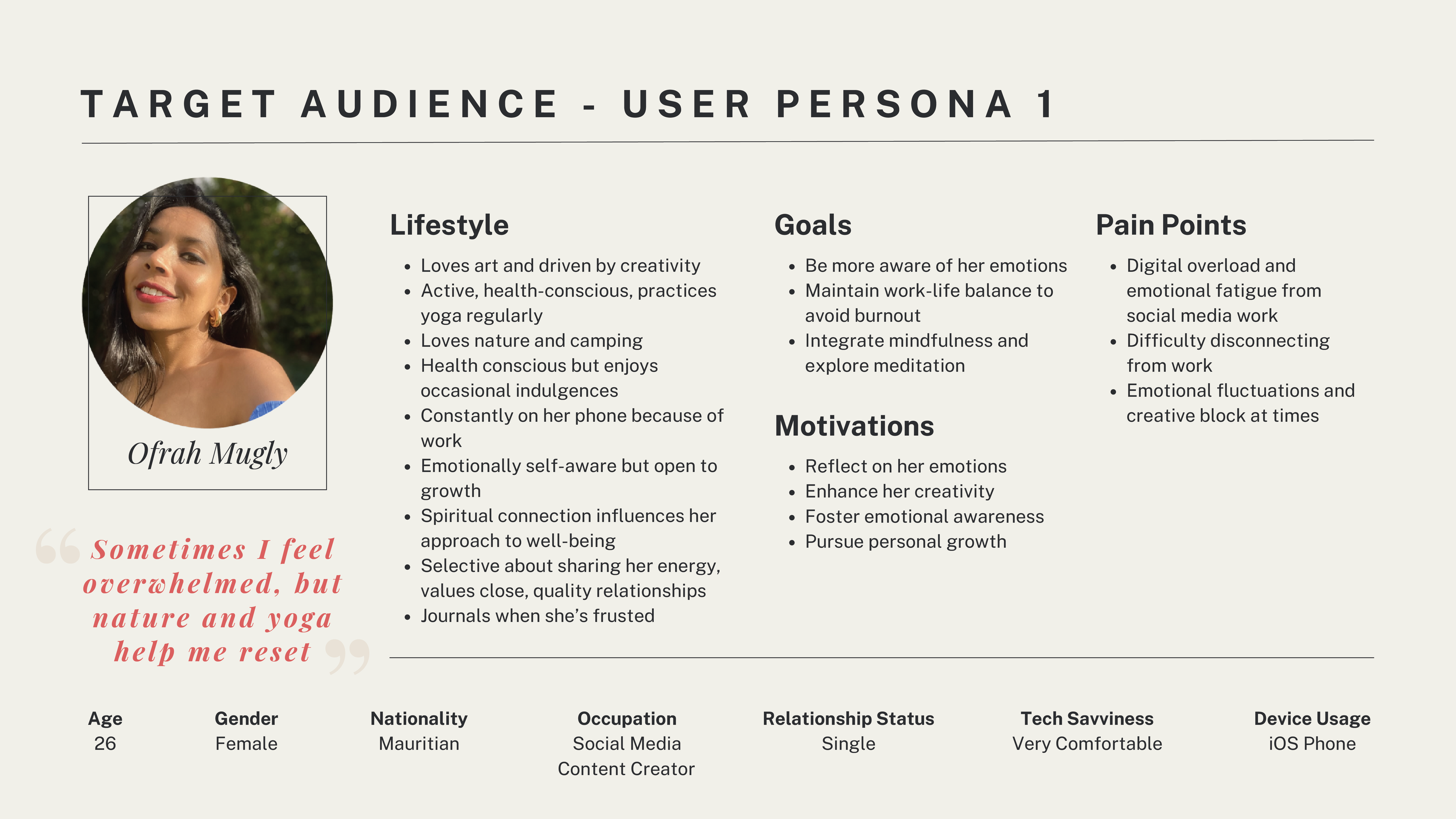
Figure 1 : User Persona #1
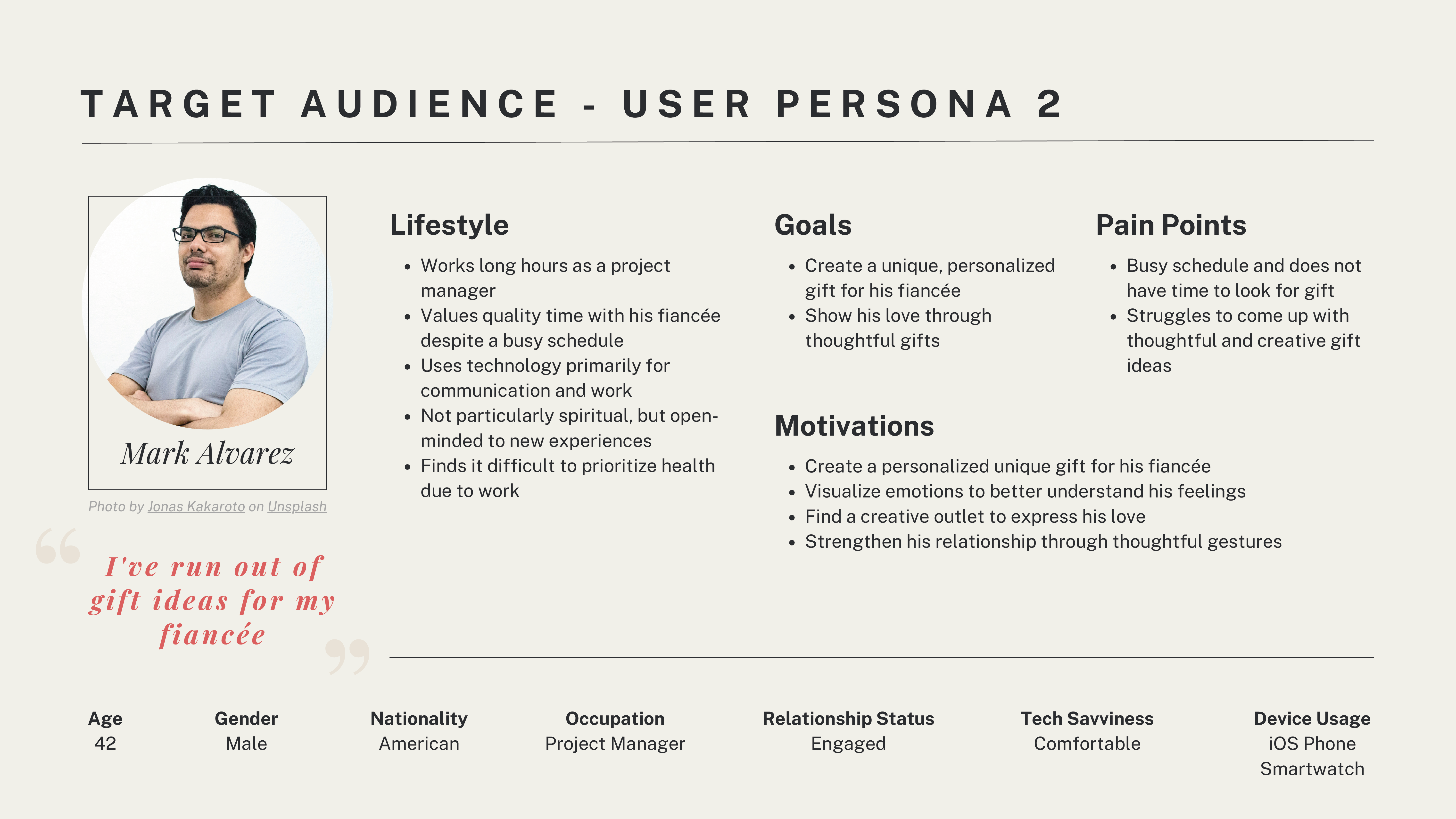
Figure 2 : User Persona #2
Empathy Mapping
To gain deeper insights into my users' needs, behaviours, and pain points, I developed empathy maps for both user personas (figure 3 & figure 4).
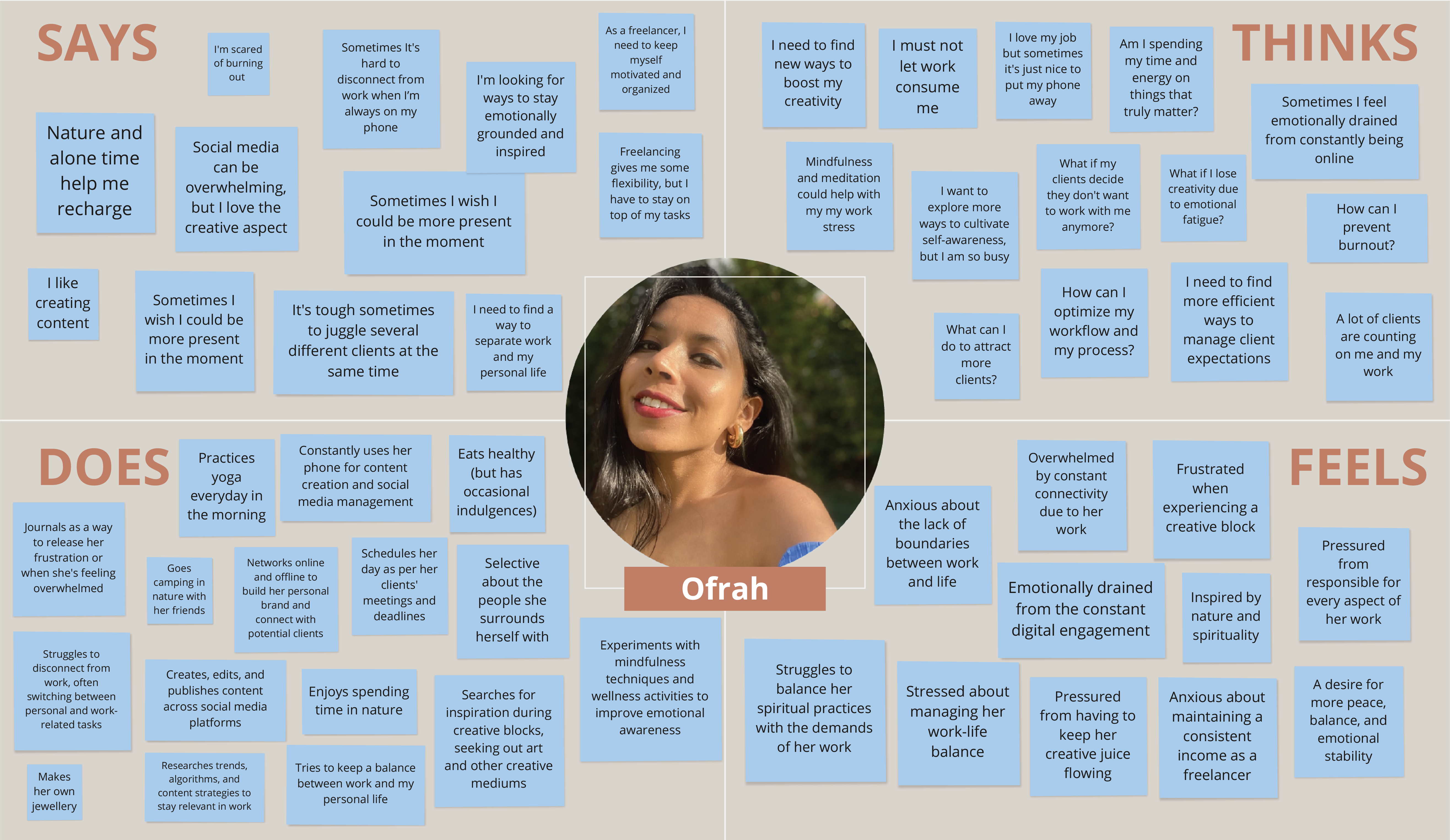
Figure 3 : Empathy Map #1
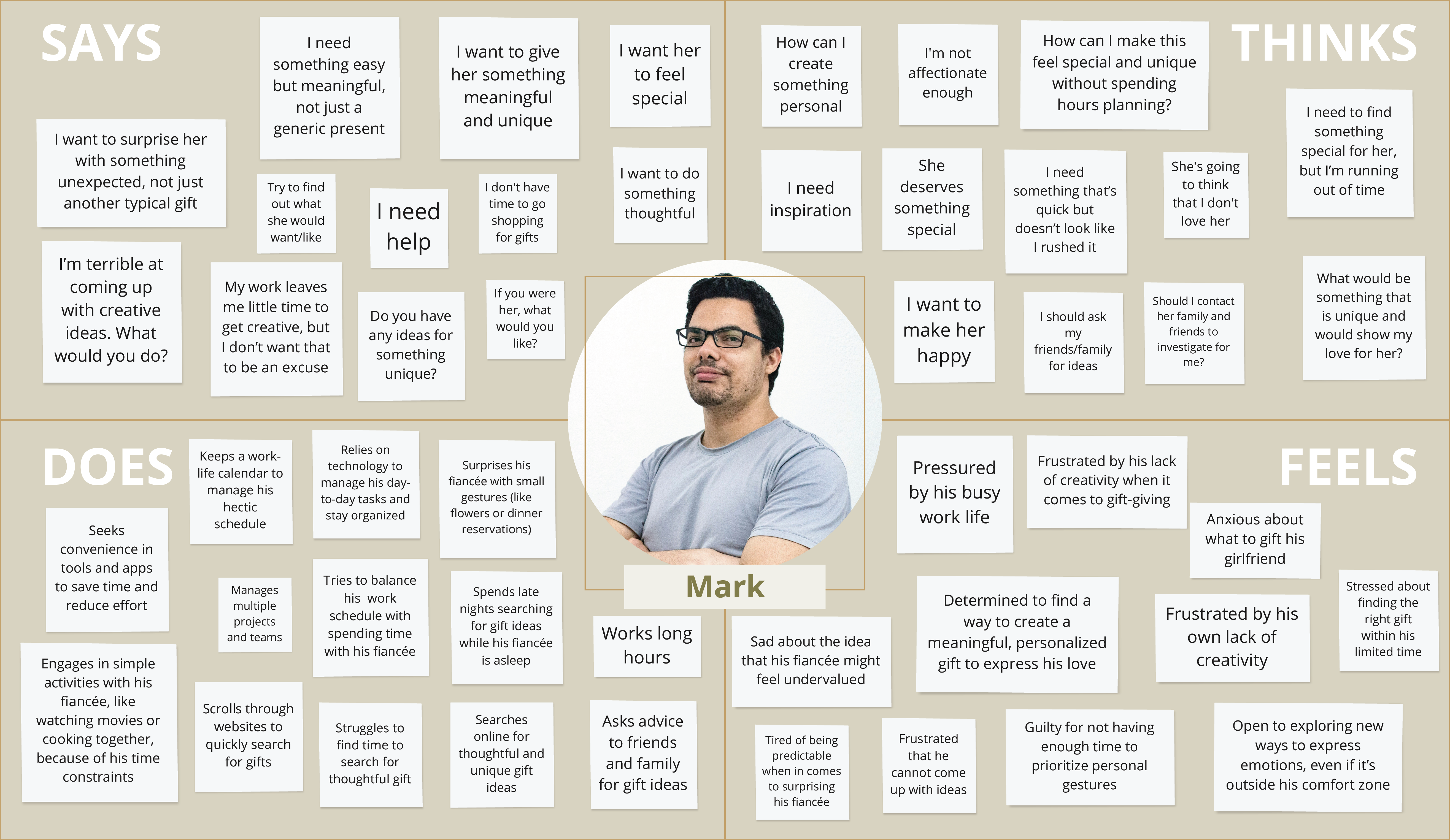
Figure 4 : Empathy Map #2
Journey Mapping
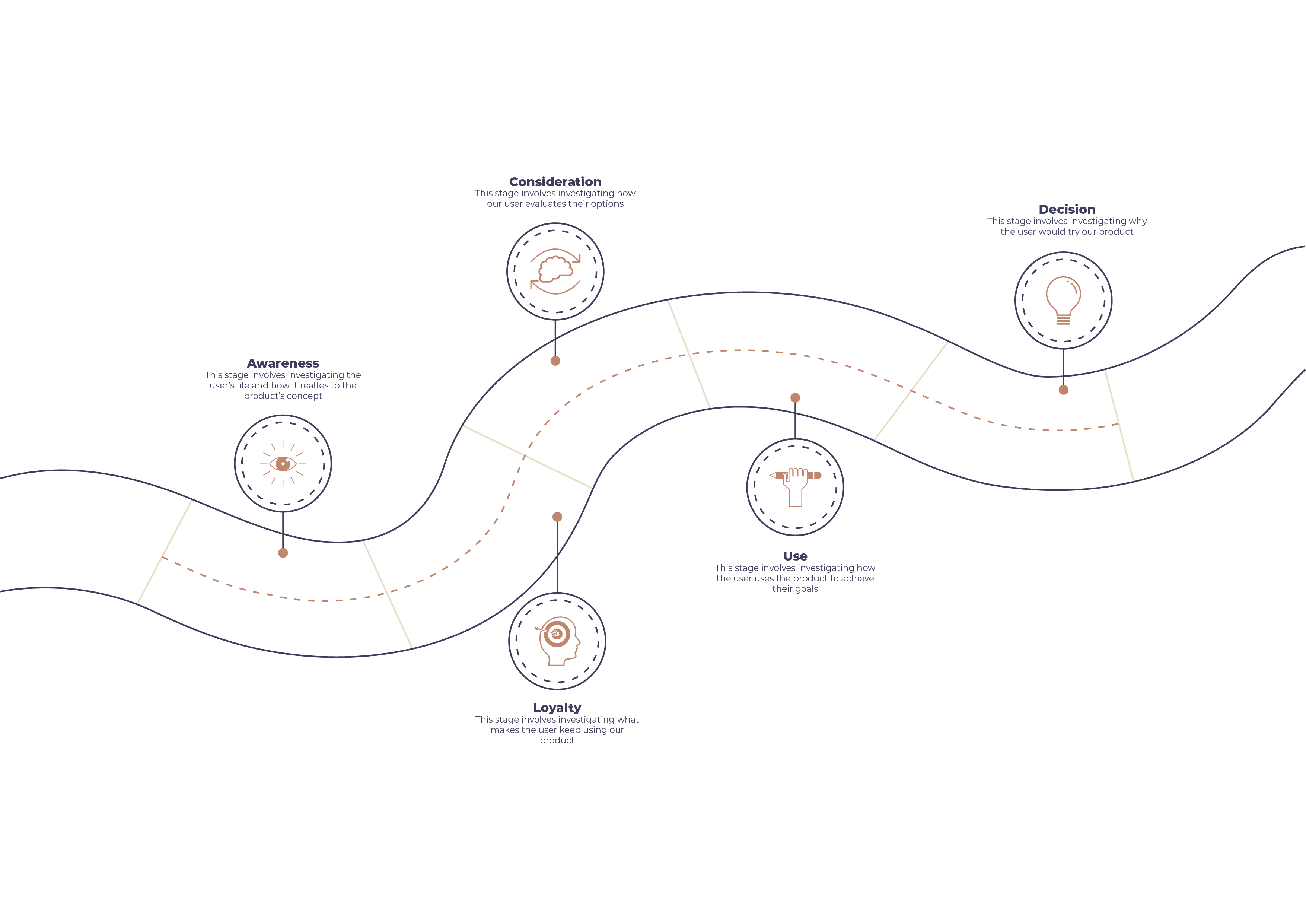
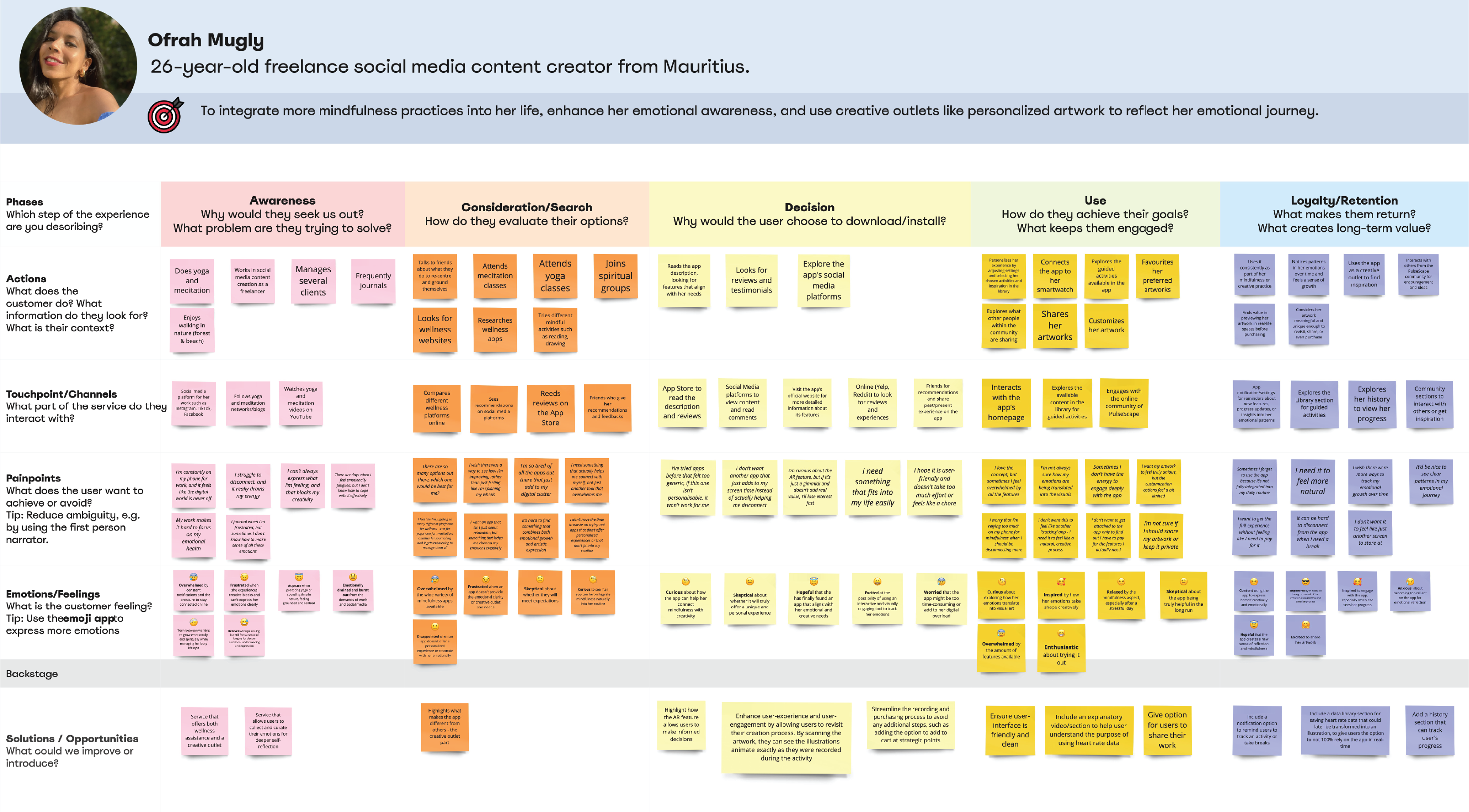
Figure 5 : Journey Map #1
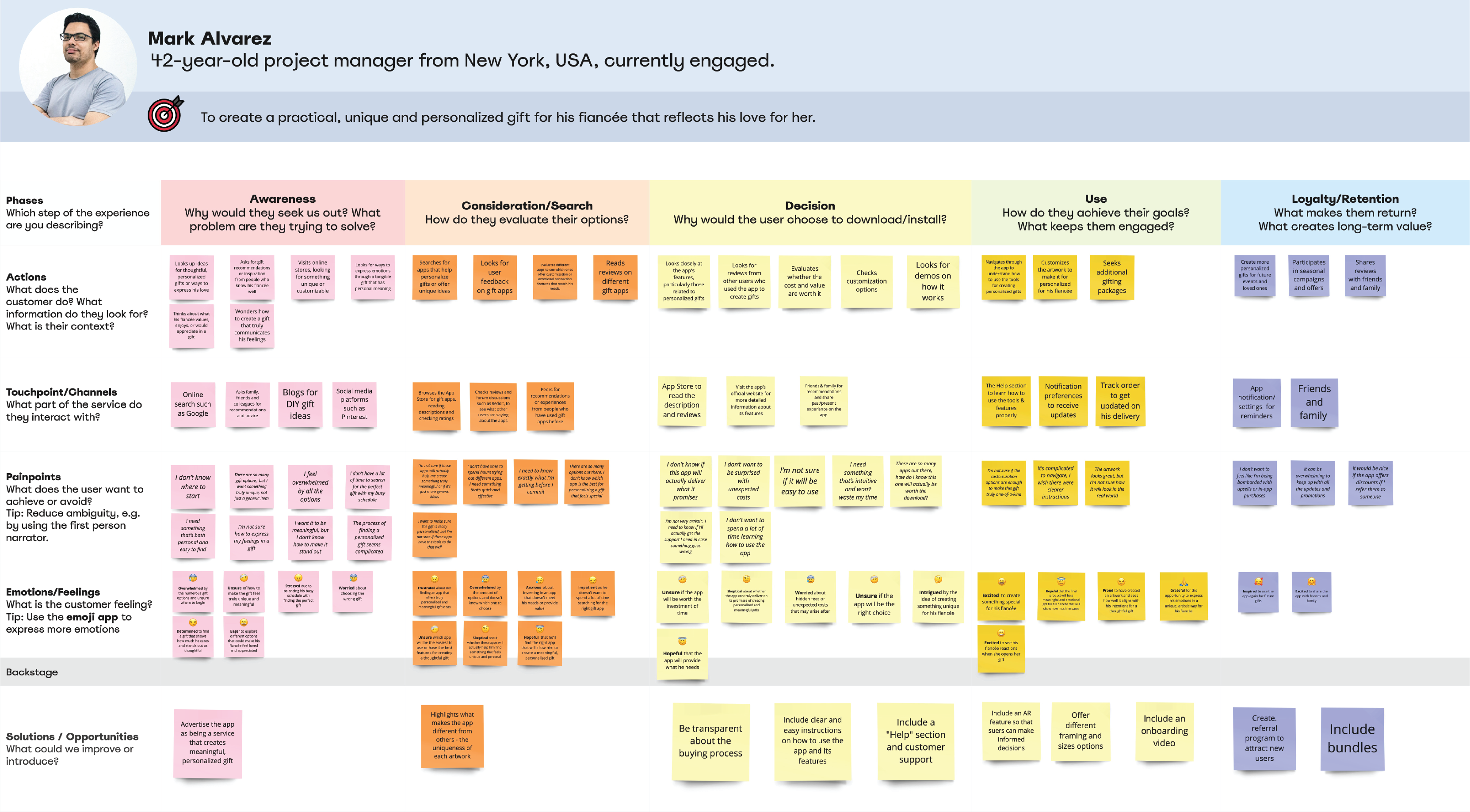
Figure 6 : Journey Map #2
03
Research
Competitive Analysis
The aim of my competitive analysis (figure 7) was to break down design patterns from not only existing wellness apps, but also different AR technologies used in different sectors such as art and furniture so as to examine how and why they are implemented. My aim was to better understand how different solutions address common user needs and enhance user-experience and engagement.
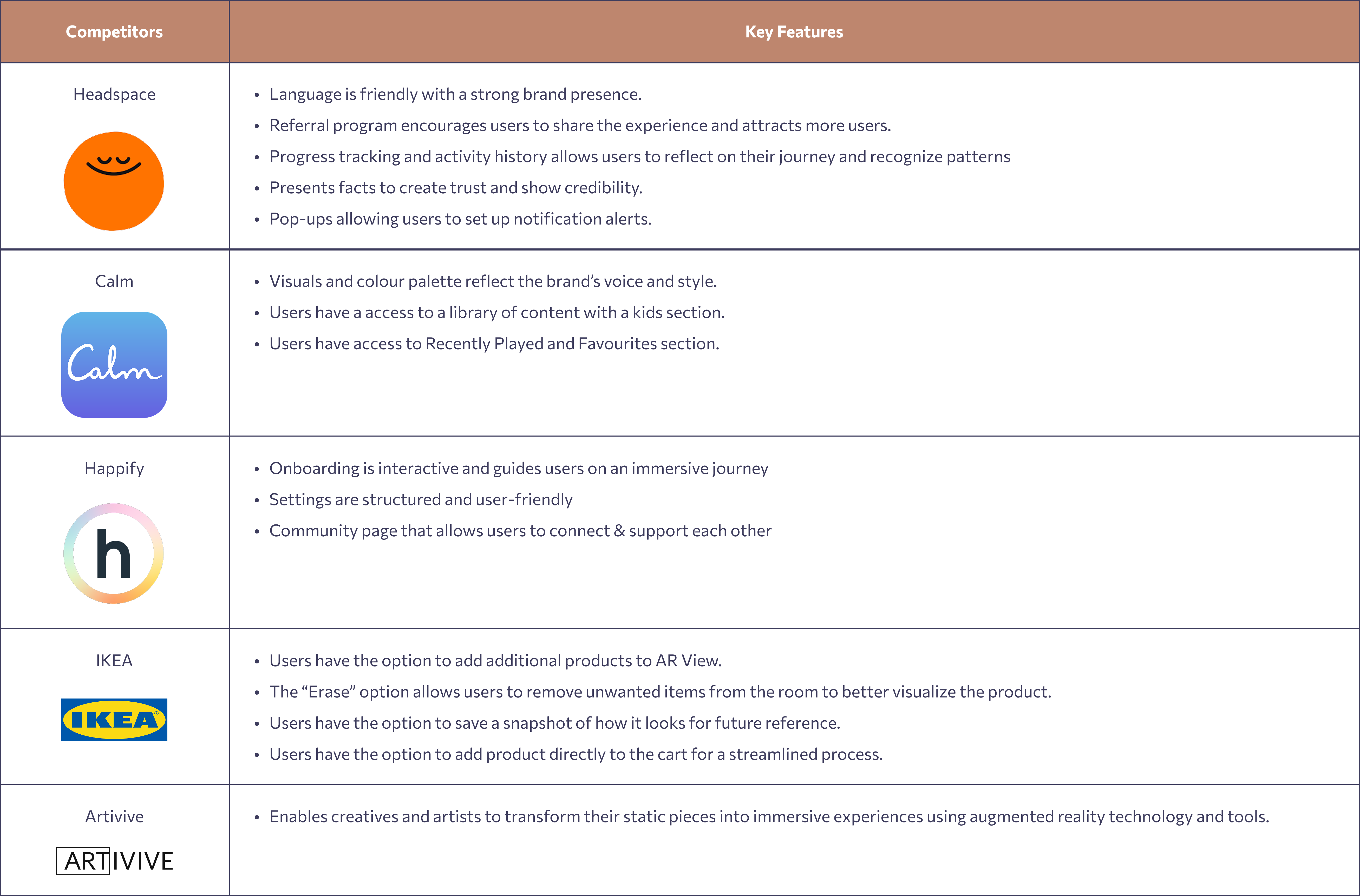
Figure 7 : Competitive Analysis
04
Design Process

Defining the User Flow
To ensure a seamless experience, I designed a user flow for fitted for my two personas (figure 8).

Figure 8 : User Flow
Heartbeat Data Interpretation
Each dot represents a recorded heartbeat
(figure 9).
The closer the dots appear, the faster the
heart is beating - a clear signal that the user may be
stressed, agitated, or
emotionally heightened.
The farther apart the dots, the slower the
heart rate, indicating the user is likely calm,
relaxed, or at ease.
In a glance, the emotional state shifts from chaos to calm, captured in rhythm.
Figure 9 : Heartbeat Data Visualization
Low-Fidelity Wireframe
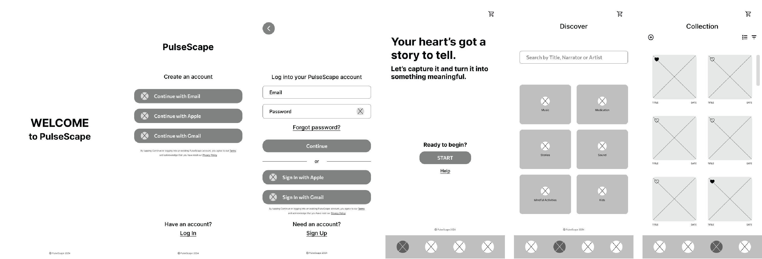
Figure 10 : Low-Fidelity Wireframes
Visual Design
The goal in creating this style tile was to convey a sense of therapeutic calmness, holistic balance, mindfulness, and inspiration. I selected this colour palette that would evoke these feelings, ensuring the visual identity aligned with the app's purpose (figure 11).
The Playfair Display typeface adds a touch of refinement while maintaining a calming and approachable aesthetic, reinforcing the intended mood of the design.
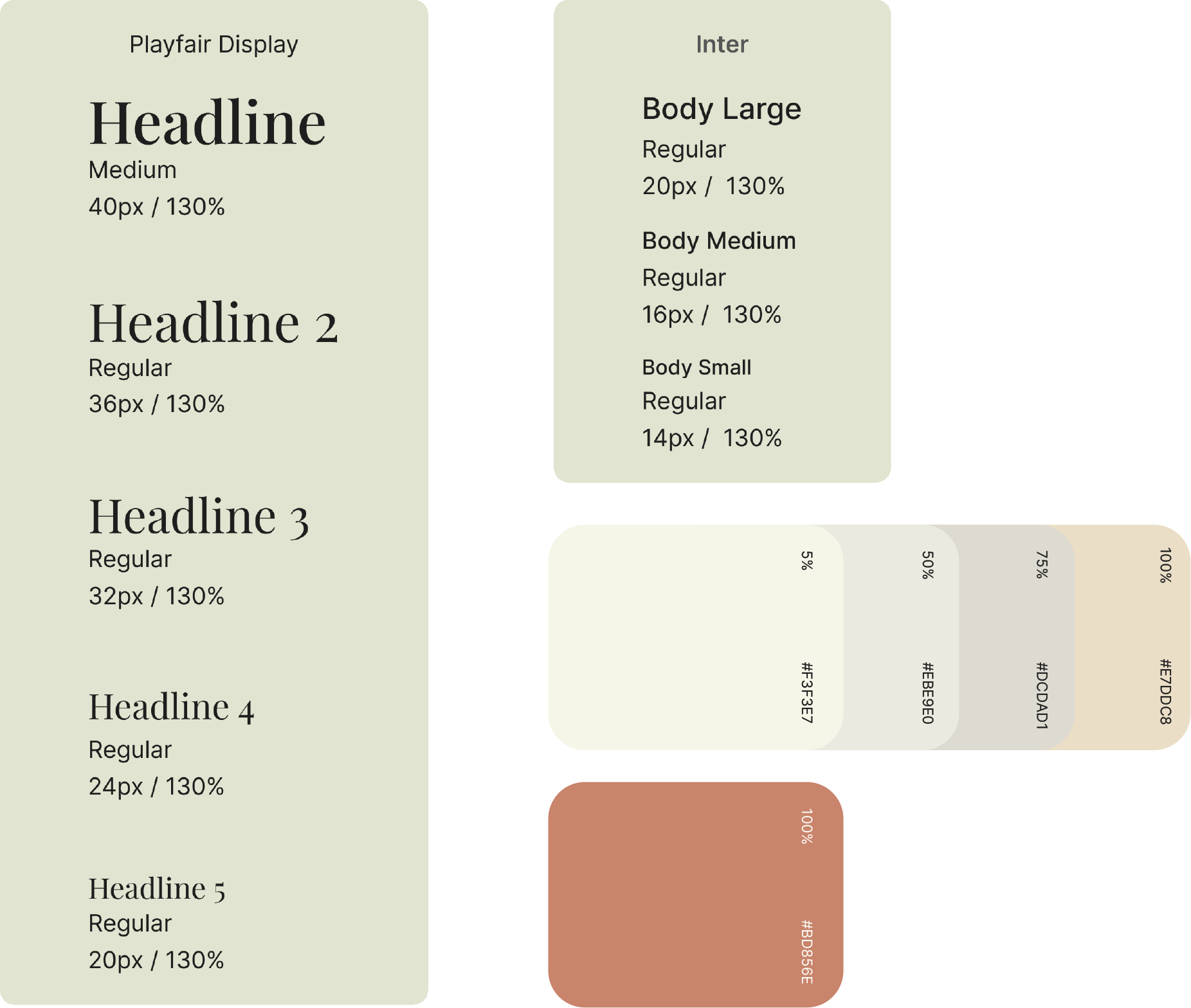
Figure 11 : Style Tile
Building the 3D wireframes and AR Experience
I imported the model into Adobe Aero (figure 12) to test the augmented reality (AR) view, ensuring that the model would display accurately in real-world environments (figure 13).
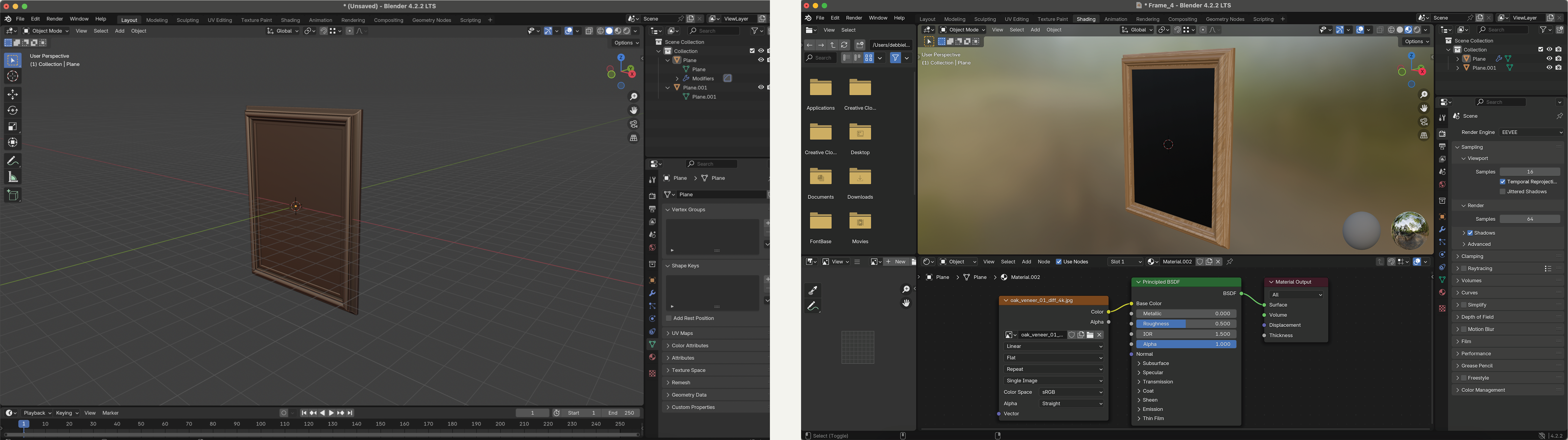
Figure 12 : Building the 3D frames in Blender
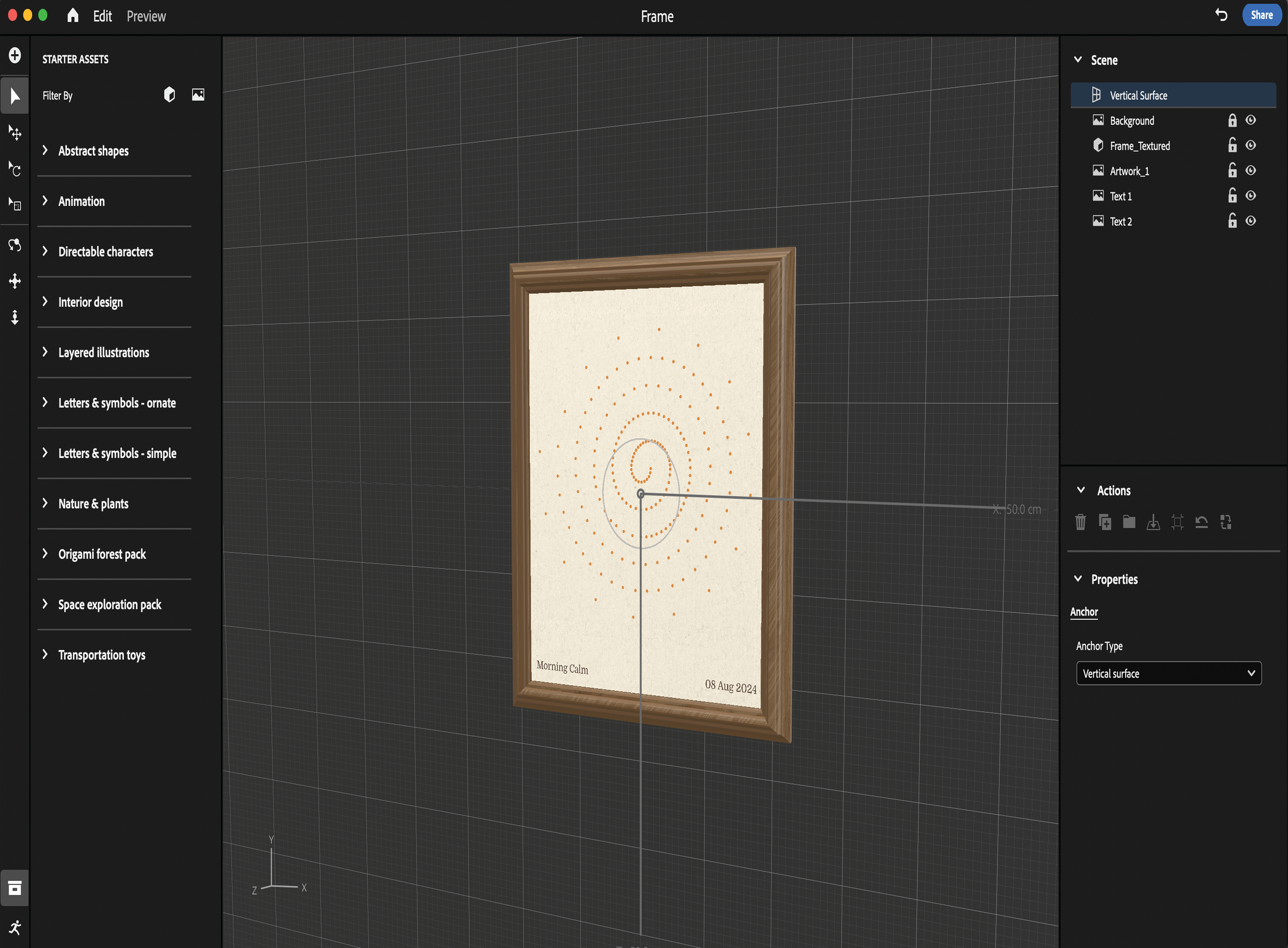
Figure 13 : Testing the AR experience in Adobe Aero
05
Usability
During the usability testing, we gathered feedback from four participants, analyzing their responses in relation to the four key issues identified during our heuristic evaluation of the original Places4Students website.


33%
participants found that the order summary could be better integrated.
50%
participants found that additional guidance would improve the user experience.
06
Final Design