Visual Typography | 2023
graphic design • illustration
Project Lead
Self-directed
Tools
Adobe Illustrator
Duration
2 weeks
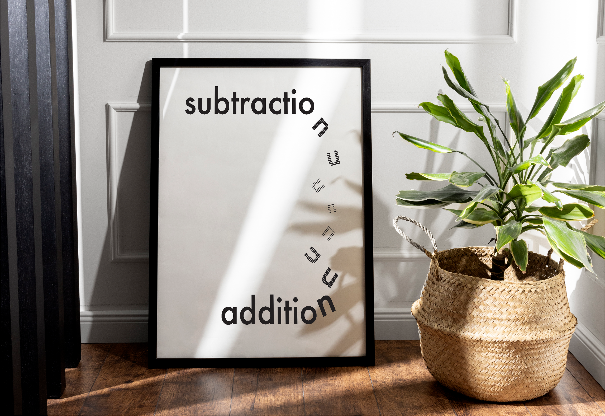
SUBTRACTION vs ADDITION
Carl Dair - a Canadian designer—founded principles that explore typography and their relationships to design in his book, 'Design with Type'. He outlined seven key contrasts, which are: size, weight, form, structure, direction, texture, and colour.
Using these typographic contrasts, I designed a visual poster that defines the meaning of the word “subtraction” and “addition” using the Futura PT typeface, with the aim to convey visual meaning through type contrasts.
PROCESS
Sketches
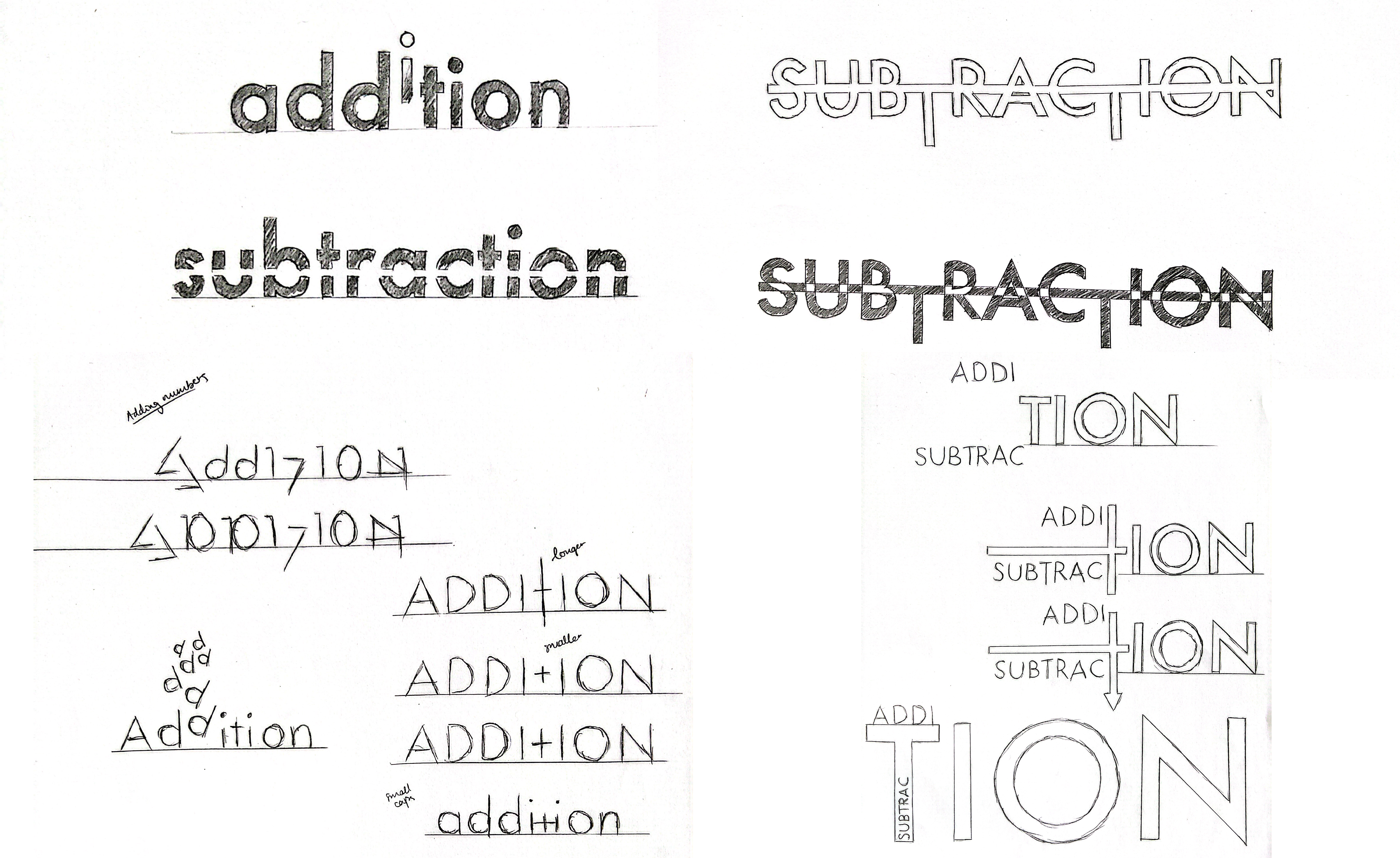
Figure 1: Sketches of ideas for the visual typography of the words "subtraction" and "addition"
Iterations
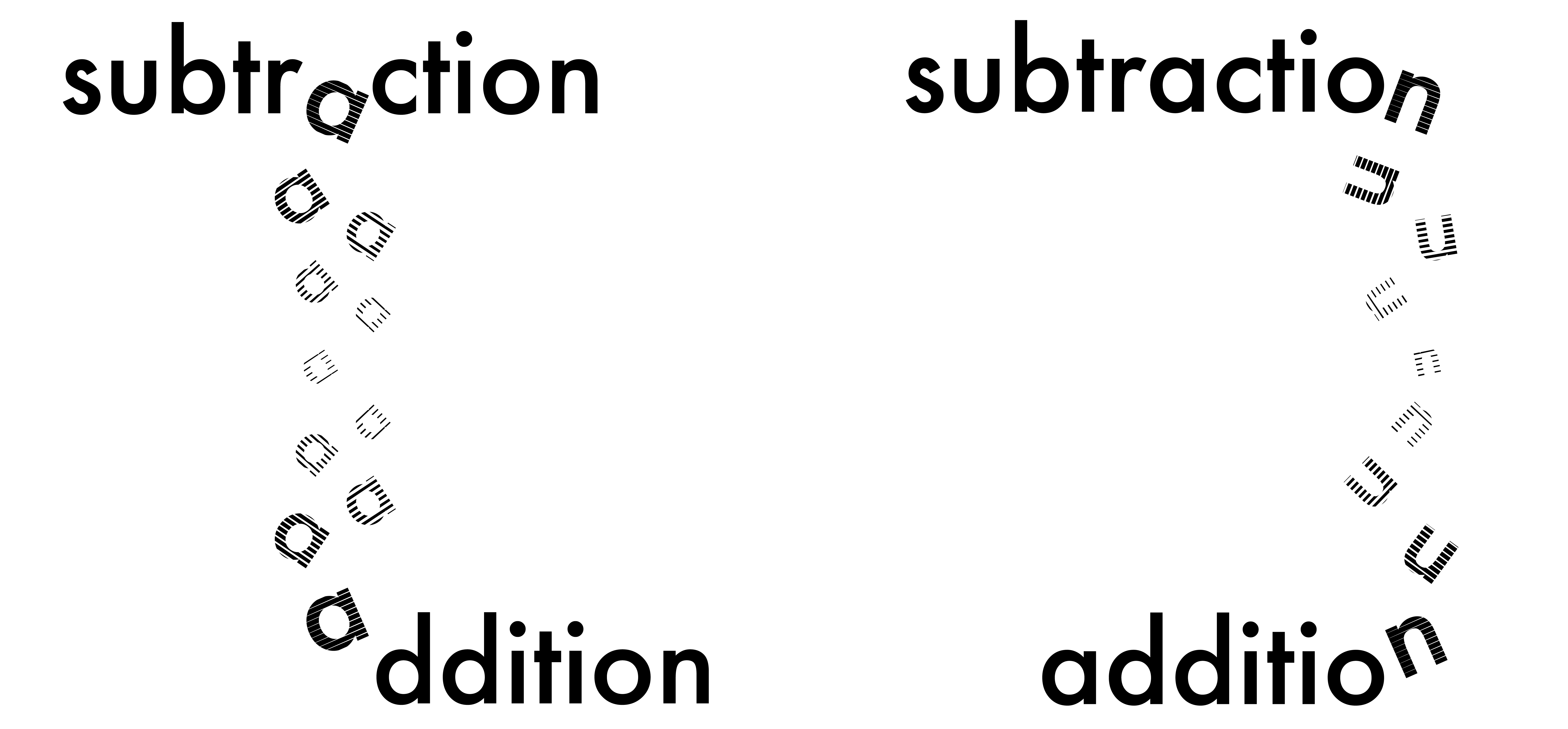
Figure 2: Two design iterations for the visual typography poster
FINAL DESIGN
Figure 3: Final poster design for the visual typography